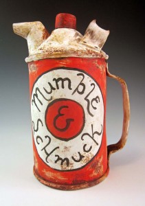
Mumble and Schmuck


MumbleandSchmuck_ GO115_2013


Let’s take Schmuck first. It’s not what you think. That’s Yiddish for fool, jackass, prick or worse.

In German the word means “jewels or ornamentation.”  And in graphic design it relates to layout, sometimes with letters, sometimes with geometric lines and circles.

It had its heyday in the  Modernist and Constructivist eras of the early 20th century, but it’s a delightful new term to me.

And, yes, schmuck is part of the etymology for the term “family jewels.”

As for Mumble, that’s my own graphic design term, as far as I know. One I developed to describe what I actually do when I am applying lettered ornamentation.

Both terms have a useful place in decorating my ceramic faux metal cans, pitchers, fillers, pails and whatever’s-to-come-from-this-creative-experiment.

Up until now, I have generally been mashing-up the layout, colors and script of old product brands onto my ceramic surfaces. It isn’t gospel copy, but rather the impressionist essence, I seek. Therefore, plenty of times I find myself “suggesting” a product’s features and benefits.

When I am “Greeking it in” – another highly technical phrase for suggesting content or layout, but not actually producing it – I am hearing in my mind the essence of what it must be saying. My brush moves along with my thoughts, mentally “selling it'”to the consumer.

At times I suspect I feel this with as much conviction as the original copywriter might have experienced; I’m just not making it readable. I’m mumbling, and it looks like Greek to all who cannot read it, but it contains real thoughts and real words. Hence: Mumble Script.

Of late, my product-defining brush is finding its own brands to sell. They might be ironic and readable,  but the hyperbole-laden and intentionally unreadable body copy remains.

~Liz Crain, a writer and painter/decorator who mumbles on purpose.


Share this:

Ceramic Yoga

Sometimes it’s just necessary to see how far you can push it. I call it finding the Edge of My Stretch, after some yoga instructor’s encouragement to go further,  but just the right amount of further and no more. Making the Hot P Oil Can above involved the fun challenge of asking wet clay to behave in yoga-like ways, both gesturally AND structurally, and to look beautiful while doing it.

Clay has great compressive strength. Downward pressure is generally not a problem, especially if it is allowed to stiffen slightly before piling on another layer.  But stretching it out in unsupported gravity-defying lengths is just asking it to sag and crack and misbehave: clay does not have very good tensile strength!

So, let the stretchy fun begin! One kind of vessel form that continues to interest me is utilitarian and industrial, but old and beat up. Watering cans, buckets, spice tins, old wastebaskets and all kinds of commercial – many from the petroleum industry – containers. My fondness is for early 20th century pre-plastic forms, some made of glass, but most made of metal, a material that has exactly the opposite compressive and tensile strength properties of clay.

It becomes an interesting proposition, then, to fashion a semi-eye-fooling version of one of these containers, soldering, rivets and all, AND to push it even farther than the original to the ceramic asana which makes it art.
Here’s one source photo (but not the main one I used, which I cannot locate now) for the Hot P Oil Can:

Some of the other photos reveal much bigger handles and longer spouts, and much less readable labels. It was easy enough to form the ovoid body with its splash guard on top. It was even pretty easy to add the particular horizontal welts along the bottom and top edges and  to make the crimped smaller foot.

The challenges were in making that outrageously loopy handle and that long-necked spout with those particular angles, all while the clay was still wet enough to curve, but dry enough to stay put. A few times I needed three hands and I definitely needed to delicately prop things up until firm.

Aesthetics-wise, I usually intend to make objects that look “real enough.” By that I mean that they highly recall the originals but are still clearly NOT them. If you want uber-realism, buy the actual thing or take a photo! Otherwise, let’s see evidence of the hand at work. Same goes for the decoration.

I applied pale blue underglaze “primer” color to the leatherhard clay, bisque-fired it and then added many layers of mixed underglazes for the old label. When they had all dried, I lightly sanded and scratched those layers to suggest the wear and tear on old painted-label cans. I ‘greeked’ in the body lettering, something I really enjoy doing.

The metal parts have a glaze called Ming Gunmetal, a useful low-fire glaze which is a satiny silver breaking to green, as you can see in this close-up.

Sometimes I position my body in the ‘pose’ of my pieces. It’s another way of understanding them and is surprisingly helpful. I guess the yoga reference goes beyond creative stretching and problem solving, then, all the way to the actual thing. This vessel suggests balancing with big outward movement: Extended Hand to Big Toe Pose, which I find easier to do in clay!

Share this: