Thursday’s Tile: Altered Hearing and Inner Ears

This post is the beginning of the end for the Thursday’s Tile blog posts. I plan five photo essays for each of the senses on the Five Senses Bench and then a summation post, with everything ending in late March, after six months of Thursdays.

Many of the tiles on the Five Senses Bench are there because they express the opposite of what might be expected for that particular Sense. They might be another take on it, an anti-view or an out-of-the-bench tangential, thoughtful observation. Gosh darn those Artists!

Even though some of these tiles physically wound up applied on other areas because they could pass for two or even three senses, this grouping includes those that call to us to take the indirect route to even the things we could never hear.

Up above is a rendition of the main figure from The Scream by Edvard Munch, an image which strikes to the core of modern angst even though it was painted a hundred years ago. Munch painted several versions over almost 20 years, starting in 1892. Sometimes he titled it The Cry of Nature. Our Inner Ears hear this shrieking skeletal spectre and we come away wanting to cover our own ears and scream as well.


Next up we have words for sounds and two critters. If we could not read, would we even hear these animals? Does it matter that bunnies are some of the most silent creatures out there, only screaming in pain or ecstasy? And why oh why would a bunny be saying D’oh!? And, if we had never heard D’oh! spoken would we even understand what that speech bubble meant? Anyhow, the bunny says D’oh! because it was a placement opportunity sight gag that just came up and we took it.

The dog in the last photo reminded me that we only hear within a certain range and other creatures hear things beyond, or, in the case of bats, do things differently with sound. Bats, the only mammals that truly fly, navigate by echolocation, playing a sophisticated form of Marco Polo every night.

And what about communicating soundlessly, as this mime does? This tile is a good example of one that was suitable for both Hearing and Sight and wound up on the latter.

Below is a series of tiles that has to do with ear applications: ear plugs, ear protection – or is it old school headphones? – and a hearing aid. This is a grouping that represents things we do with and for and near our ears to enhance, deny, amplify or mitigate sound.


Do you know the old joke about the man with carrots in his ears, who, when told about it said, “I can’t hear you, I have carrots in my ears!” Well, you know it now. Dumb, yes, but a perfect example of things we can choose to do, since we do not have ‘earlids.’

So, that’s a tour of the Hearing area that involves silence, sound imagination by our inner ears, extra-human sensations, as well as hearing modifications.

Once again, here are that area’s title tiles, suggested and made by the ever-involved DP. And here’s another sight gag based on the word ring.

Share this:

Thursday’s Tile: In Praise of Entomophagy

Right above the vanilla orchid on the Five Senses Bench, right there on the pointy knee of the Taste area, are two tile testimonials to the fact that millions of people enjoy larvae and insects as a daily source of crunchy, savory protein.

We here in North America typically consider Entomophagy a survivalist curiosity, a lollipop novelty or a Triple Dog Dare suitable for reality TV. The plain motivation for including this Sago Palm grub (on the left) and the mess o’ fried mealworm (on the right) was the Gag Factor and frisson of repulsion they induced.

Every one of us working on these particular tiles (it grew into a group effort) started out like that and yet our researching, while not turning us into aficianados or grub-o-philes, did gain us a wider appreciation of all that the human palate and gastro-intestinal system are capable of.

Spit-roasted or raw? Deep fried on buttered toast? Here’s one recipe from ehow. I still would not choose this food, just as I don’t choose snails, rattlesnake or tripe, even though I have eaten them in the past.

It is important to note that I have a choice, just as the ever-insightful Michael Pollan explores in his wonderful books from The Omnivore’s Dilemma to Food Rules. I’m guessing if the choice is gummi or sago palm worms, Mr. Pollan would always advise the latter as being Real Food. Either can be delicious or repugnant according to custom, expectation and the like. Add in the knowledge that processed edibles, no matter how cute and appealing, are Not Especially Good for Us, and that choice sharpens.

Another small takeaway here is that the notion of Taste pretty quickly broadens from direct physical sensation to those cultural realms and choices. We could not capture Taste-as-Aesthetics directly in our tiles, either. The notion of Good Taste might not be translatable into an object, only a sign for it.

We can, however, take an object and call it Beautiful as we see it. Here are these tiles -all of them, this whole bench -all of it, working towards that end. Better still, DP took a mold off the Sago Palm Grub and remade a solid version of it as a brooch! I like her Taste: it made a beautiful personal decoration in a deliciously gross kind of way, and I won’t ever have to eat it!

Share this:

tHURSDAY’S tILE: dOWN THE rABBIT hOLE

Exquisite. Sublime. Surreal. Urban. Funky. I might give any or all of these appellations to this tile. It is also disturbing and just plain wrong. First offense: It’s sdrawkcab. Second offense: It’s that way on purpose.

It’s sited very noticeably on the front seat edge of Smell on the Five Senses Bench, which might be its third strike. Where are we, really? Looking at a mosaic bench…or trapped in the SEWER looking out at the illusion of a mosaic bench? A man dreaming of being a butterfly or a butterfly dreaming of being a man? And what the hell is that awful smell? No, wait, don’t tell me.

Saving graces: it is still readable, still a sign in rectangular format, still calling up connections to its placement.

It is the work of a vigorous, clear-visioned young man, who I only can recall as I. In the course of the semester (and maybe two) he gathered countless clay slab impressions of similar industrial signage and textures: High Voltage, high boltage. Diamond plate, screws and screens. He used these industrial textures loosely in nearly every asymmetrical vessel and sculpture he created, and left several dozen impression plates behind.

He was clearly under the influence of a certain sensibility. My memory of I is of him in constant motion on an enthusiastically urgent quest for the discovery and capture of every found version of this sensibility extant. Similar to a treasure hunter or to any other collector of naturally occurring phenomena, he believed the next best captcha was just around the corner. He cracked great jokes and sometimes talked to himself.

What rests stuck here on this bench is only semi-disturbing when compared to the range of sculptural vessel fantasia he concocted with his collected findings. It is completely tame compared to the intensity of the hunt, which probably was more of the point. And that gets me thinking about artistic process, for some truly are happiest in the Concept and Gathering stages and pass through Execution, Completion and Assessment quickly in order to go hunting again. That was I to a T!

Where is I now? Still in town? Gone to art school?  Traveling?  Working this concept (which actually has lifetime potential) or finding it both too obvious and too obscure to ride much longer than the time he did? What rabbithole cover did he sneak under and go down?  I would love to know. Matter of fact, I think I will make some polite inquiries soon.

Share this:

A Year’s Journey, One Local Talker at a Time

I want to walk you through making one small face jug, which, times 53, comprises what I have been doing all of 2009 in my Local Talkers series. Each one is unique, but there is a unifying rhythm to making them and it goes like this.

Nearly every one starts out as a hand pinched and closed sphere about 2-3 inches across.

I can barely explain how I choose The Subject Face from the 4 or 5 in each week’s column, and I have been known to drift from one face to another mid-making. I look for some expression or attribute that intrigues or amuses me. I am not making a portrait so much as an echo or an interpretation. Sometimes I read the names, occupations and responses, mostly I do not until after I have chosen and started in.

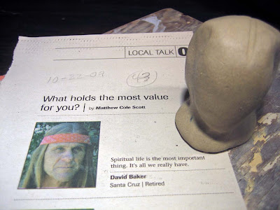
Here’s the choice for Week 43:

One thing in David Baker’s favor was I had not had anyone in a headband all year and his face is elongated with that great center part in his hair. I started by paddling the sphere into a long capsule, then pinched it to form a base, neck, chin and that scalp part, as you can see.

To my artist’s brain, it’s exactly like a rough sketch in charcoal. Add in a tiny bit of pressure to work while the clay is at an ideal wetness at every stage — although even that can be controlled. (I could work for months and years on this if I needed to.) I want it done in a few days and will control the drying with brushed/sprayed on water and plastic.

Here are the basic Mount Roughmore features in a mix of a lively but stoic face:

I am pleased with this profile and demeanor. It has a classic feel: Egyptian? George Washington?

Next comes details and rough hair.

The clay’s perfectly malleable but too sticky to finalize things, so I am relaxed about burrs and fingerprints. All in good time. I have delineated the headband position before I commit to much more hair. Oh, and I have made peace with a certain androgynous quality I find in nearly every face.

Now the headband is on and I am starting to think about where I will add on a spout, perhaps a handle and other decoration and where exactly I will press on this week’s number.

All those additions need to be in place before final touches, otherwise I will be fighting with myself and my tools. I want something rather organic and abstract for a spout, suggestive of a feather or an antler, but not actually recognizable. Not sure about a handle…there’s plenty going on with the knot in the headband.

And here’s what arose in response: An open-ended spout-structure, surrounded by another supporting loop and a pressed-in 43 in the hair.

The newer additions glisten due to the clear water brushed on to both help attach them and to provide a unified smoother surface.

One more shot from the front. Is that a pipe? A blossom? I am glad it is not specific! And I like that it is subtly resting in back, not taking anything away from the face in shape, subject or placement.

And that’s that for now. It’s too wet to attempt much more today on it. It is good to wrap it up in plastic and let it sit at least overnight, exchanging moisture levels, drying slightly on the outside and letting me see it anew on the morrow.

If things go at all like they have with countless other small face jugs, when I work on this piece again I will need to restate hair and refine facial lines, “disappear” some seam lines and edges, clean up those burrs and fingerprints, and maybe even patch a crack or a thin spot. Once that is done, I will make sure the piece sits level, sign and date the bottom and begin drying it ever so slowly, gradually loosening and removing the plastic, for the next week or so, until it is bone dry and ready for the bisque firing.

I have said to countless people over the years that clay taught me patience and I can see once again how true that is in describing what I do without thinking for one small face jug. Times that by 53 and I see I am really working on Mount Rushless, and I guess I can claim some sort of bonafide Clay Abiding Award, knowing as I do, when to hold ’em and when to fold ’em.

Share this:

Thursday’s Tile: Copy-cake Ape-a-tation

Here’s the original “Cake” by Wayne Thiebaud:
And here’s a shot of the tile rendition of it on the Taste Area of the Five Senses Bench:
I’d say it is a fair copy-cake ape-a-tation.  But only fair, if that is the only standard to judge it by. It is tentative, small, soft-edged and melty in comparison.  Maybe an ice cream cake version. But to be fair in another way,  it was never intended to be shown side-by-side with the original!
To the copy’s credit, the hues and relative values are actually quite impressive and almost give off the same luminosity, especially in the sunlight. That righthand yellow section could be a lot lighter and purer, but so?
Thank my artful goodness there are plenty of ways to judge copies beyond photographic resemblance.  As an homage to food art and a terrific artist, it works great. (Just like the version of Andy Warhol’s Campbell’s Soup Can up on the back of the seat does.)
Plus, the medium of underglaze and the changes wrought by the ‘heat work’ of the kiln are enough to render whatever control this unknown artist exacted purdy near null and void. It is what it is. Part of ceramics is certainly surrendering to the will of the Kiln Gods. C’mon Happy Accident!
Knowing all of this, if we then start asking about flavors and sensations in the largest sense possible, we can easily see how much this tile embodies the Spirit of  “Cake” and not just the Letter of it and take our satisfaction with that deep into our artistic bodies and minds, thereby affording a Greater than the Five Senses Experience, all from one little copy-cake.


Share this:

Working with Live Models

Question: Is there a “Do By” date on some visual art endeavors?
Answer: Yes there is, especially if you are working with subjects that will manifest change, such as moveables,  mold-ables or mature-ables.
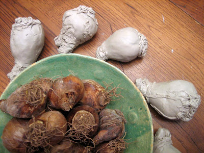
In the case of these daffodil bulbs, that means if you want to model an assortment of carefully observed and individually rendered ceramic bulbs, you need to get to it before they inevitably sprout into daffodil plants and flowers, or go off trying. It’s Nature’s Way.
Bought last September during bulb planting season here in the Mediterranean climate of California’s Monterey Bay, they were going to be a quick study and then plunged into a pot of rich earth for the winter. Instead, they spent those months in a paper bag on a shelf in my warm studio. The still green and unfinished  “quick bulb studies” happened this past week and some of them ring the bowl of wimpily sprouting models in the photo.
Although I think this particular bulbous tale has a last minute happy ending for both art and nature, it has got me thinking about timing in new way.
Carpe diem! Sometimes the timing is obvious. Paint the cut flowers and sliced fruit still life arrangement before it sags and smells. Sketch your kids before they grow out of that breathtaking innocence. Photograph the mountain trail sunrise should you very likely never walk that way again.
And sometimes the timing is insidiously glacial or blastingly unforeseen, meaning you probably should hie yourself to the studio lest you change as well. You might lose your stoke, get a better idea, or just get called away by Life. No, not might, but assuredly will.
To paraphrase Zen and the Art of Motorcycle Maintenance by Robert M. Pirsig, “The ‘Do By’ date you’re working on is a date called ‘yourself.'”  We are live models as much as the subjects we attempt to capture. We can’t step in the same river twice because the river keeps flowing and so do we, us moveable, mold-able and mature-able change manifesters. Carpe Narcissi!
Share this:

Thursday’s Tile: Irresistable Sense Barrier

For all the tiles on the Five Senses Bench that revel in glorious sensual experiences, there are a few in each area that speak to their lack, erasure, or pain, and, in the case of this haunting tile, of their conscious need to be modulated or even forbidden.

This tile was certainly more than its maker bargained for. JP was openly enthusiastic about the bench and its evocative possibilities. He fairly quickly chose this image, finding it creepily amusing.  His artistic sensibilities led him to cut it in a stand-alone rectangular portrait format and to add the circle pattern background behind the figure. While most tiles need the canvas imprint pattern — made when the wet clay slab is first rolled out — to be smoothed, the fact that JP left it in place (whether through intention or oversight) adds a certain appropriate screen of tactility that is both decorative and a tad forbidding.

It’s basically its own work of art which happens to be attached to another work of art. That winds up creating an isolationist stance in both narrative and actuality, most assuredly adding to the work’s emotional power.

I originally had gathered this image thinking it would be placed on the Smell area. But that was not JP’s take on it: he wanted it on Touch. So you can find it rounding the front edge of the seat in Touch but closely bordering Smell. This placement always causes a blip on my cognitive radar, further adding to its uncanniness.

In the end, this kind of medicinal mask is more about Touch anyhow: not being touched by breath, not letting airborne germs touch one’s lungs. Not letting any stray objects enter or leave the mouth. The mask-wearer’s eyes are disengaged and distractedly looking up. No smile or frown can be read, therefore No Emotional Touching allowed either! Sterility on steroids!

And JP kept the palette painfully simple. Bare clay, lots of white with a subtle linear texture and those incongruous blood-red polka dots with a veil of smaller canvas dots over most everything else.

This tile winds up being a psychological study of nearly Jungian proportions. It is a strong guardian of the Shadow, the Forbidden, the Anti-Sense and it’s very hard to divert one’s eyes once it gets you in its grip. Must go gaze at it again soon.

Share this: