The Artist Takes a Sierra Vacation

Stepping away from the incessant work at hand in the studio often seems nearly impossible, if not clearly mad. If I’m not doing “it,” for sure no-one else will be! Yet, step away I did for a week to a cabin at Mono Hot Springs Resort, a place dear to my soul. Getting Out and Away relieves the ego of those false impressions of indispensibility. Done properly and long enough, time spent in different places with different folks allows the senses to fill with newness, the brain’s counters to return to zero and, as a side-blessing, a BUNCH of new impressions to fill the creative tank. Here are a few ways my five senses were re-activated by NOT showing up in the studio the last week of September.


SMELL

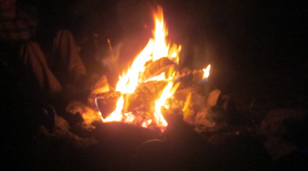
At first, smells are compromised. It is cold in the autumn shade and the air is thin at 6500 feet elevation. Gone are the fat, fully-oxygenated breaths of ocean fog,  valley agriculture, fast food grills. Instead the limbic system experiences crushed juniper berries from the tree by the cabin,  the really-dry wood fire roasting assorted delicacies: S’mores and Jiffy Pop. Later come whiffs of rain, damp picnic tables, snow flurries, mineral hot springs, and the entrenched aromas of an old, dark and end-of-season sparsely-stocked resort store.


TOUCH

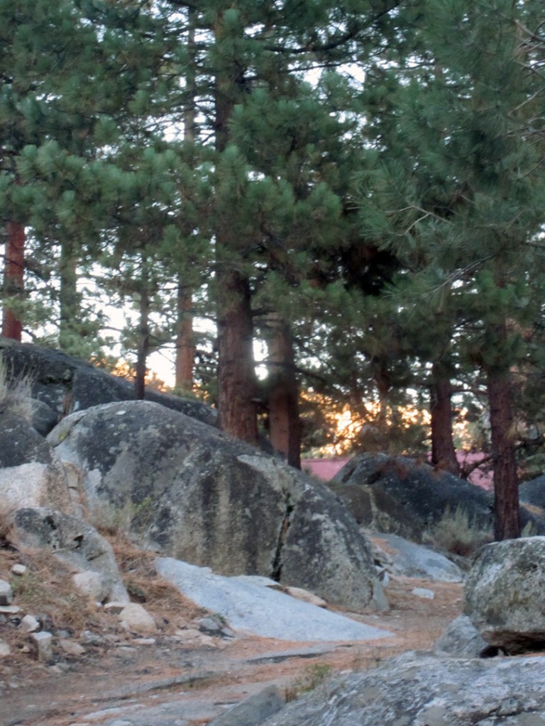
No doubt about it, granite IS the High Sierra. Jumbled and tumbled, those boulders determine the shape and direction of the single-lane-road-with-turn-outs to get into the place, as well as the nature of the “sand” (not dirt) surrounding our cabin. That sand is DG: decomposed granite. Boulder-hopping across the river to the vintage hot pools is fine, until you lose your footing and land awkwardly on a jagged edge, trying to avoid a dunking. You have been touched by the mountains and HARD! Time to get a massage from Cherrie at the Bath House. Time for a few hours’ swing in the hammock in the afternoon sun, reading Neil Gaiman’s American Gods, being touched in a different way because you have the time to be.


HEAR

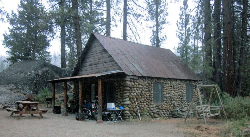
For me, the Root Sound of a Vacation is that of a wooden screen door creaking and slamming shut. There’s plainly nothing else like it. It’s a primal imprint. Wherever my childhood vacations took place, if they were not in tents they involved that sound. From the Feather River to Clear Lake, Burney Falls or Guerneville to Beaver Dam Lake in Cumberland Wisconsin,  I associate a wooden screen door’s creak/slam with adventure, leisure, lots of family time, chilly nights, daytrips to interesting places. SO not home – yet the home of a different kind of knowing. Cabin 20 at Mono Hot Springs has the quintessential wooden screen door, nearly a character from Central Casting, and I have to admit to making it work its magic over and over on purpose this time around. Distant Second But Still Special Sounds: Thunder, the Immense Quiet With Breezes, Max’s Honda Trail 90 across the Horse Meadow.


TASTE

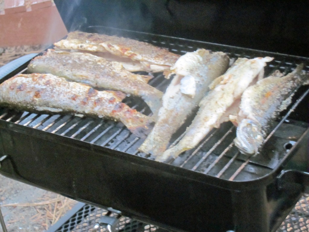
Nothing, absolutely nothing, compares to tasting a freshly-caught rainbow trout dinner. We enjoyed both grilled and pan-fried. We also had enough leftovers to take home, which made the most exquisite trout/tuna salad in the next week. Thank you fishermen and thank you trout. The above-mentioned S’mores and Jiffy Pop were pretty good as well, but not as special as fresh-that-day rainbow trout!


SEE

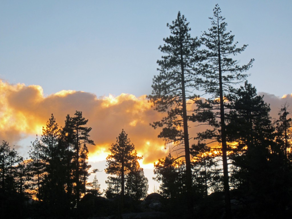
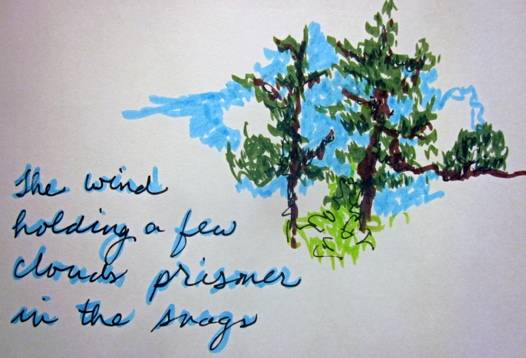
As a visual artist, I am constantly framing my world and extrapolating content and meaning from it. Although I was tempted, I purposely left the clay behind this trip. What else would strike my artist’s eyes? I took a sketch pad and colored pens and decided to just let what happened inform my visual experience and what I felt moved to capture of it. Here are the same trees from the first photo in a different context and the one I sought the most: poetic, metaphoric, epic.

Thank you trees, wind, sky and clouds. I return to my studio changed by everyday yet eternal grandeur.


~Liz Crain, who expects to get back to Mono Hot Springs sooner than the five years it took her from the first time to the one described here.


Share this:

After the Firing

You might tend to think a ceramic artist pulls her work hot out of the kiln, lets it cool and plops it on the sales table, doneAnd there ARE tales of potters doing just that at their kiln openingsAh, were it that simple for me!  What follows are a few illustrated reasons why, in my world,  there’s a slight cha cha interlude from kiln to market.

The particular firing illustrated here was the most recent I unloaded. I photographed the steps I usually take with my pieces.  From waiting for the right time to unload to putting a sticker on the bottom, there are lots of hoops.


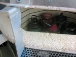
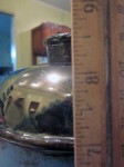
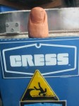
The Kiln – with Thumb Genie and Humorous Caution Sticker. I double-crossed my fingers with this giant and varied load. Firing my biggest kiln, Tsunami, always feels like I have too many eggs in one basket. To add to the apprehension, the last couple of firings revealed some serious cracking issues which might reappear. Still, there is no way out but through, so I loaded, left it on low to preheat the work slowly, closed the lid on a slow firing cycle, thinking I would just sneak up on it all.


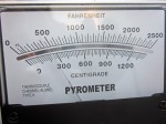
Next morning, I am almost happy when the kiln is too hot to open yet. Saves me the knowledge of certain success or certain failure and lets me stew longer.  Here’s the pyrometer saying it’s WAY too hot to even peek. Ahhh.


At under 300 degrees, it’s only sort of OK to peek briefly because it shocks and cracks the glazes. Lower than 200 degrees, I can prop the lid and help it cool faster. My first brave and nervous glimpse says all is well from the long view. I cannot stress how much of a relief this is after a night of cracked-up and distressing dreams.  I wear my well-used Ove Gloves when I unload just in case I hit a hot bottom or something.


After the long view (nothing blown  up or majorly cracked apart at first sight) there is the not-s0-small matter of whether the lids release. I  build my lids with a bit of ease (aka “shuffle”) around the spouts/flanges, but everything gets so soft in the heatwork of the kiln, it’s not uncommon for random spots to stick together, especially if gravity and proximity are involved. Before firing I paint on generous coats of wax-with-added-alumina and even so, stick happens. A completely stuck-on lid means a lost piece, so I’ve learned to breathe deeply and tap a wooden stick with gentle authority on a stuck lid. Too much force and something breaks off. Not enough, and the glassy connector-spots don’t separate. Always nerve-wracking. This was the only stuck on lid in the load and gave up after 20 or so gingerly assertive taps.


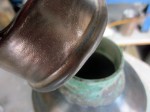
I inspect each piece as I take it out of the kiln. Top, bottom, sides, handles, spouts, seams, attachments. Anything come undone? Anything displaying movement or warping? I also test each piece for water-tightness. I put a bit of water in each one and let it sit on a paper towel for a few minutes, which is what you see here. It’s pretty clear when I’ve got a leaker and sometimes it is from the least visible places. After the close inspectiion and the water testing, I can let myself start to believe I have a viable piece.


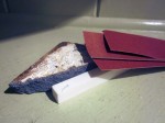
Next comes sanding. I don’t generally glaze my exteriors, but I’ve learned they LOVE being sanded. Just a quick pass with a fine grit and we have a silky smooth surface to touch. If more is needed, there is the alumina stick or the piece of broken silicon carbide kiln shelf to knock chunks off. Every piece gets lightly sanded at the minimum. Every now and then there is  a sharp edge to amend.


Let’s measure! Height x Width x Depth….Cannot do this before the final high temp firing because things shrink just that much more. That info gets entered on the individual studio log sheet I keep detailing the forming and decorating.


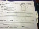
Here’s a studio log sheet for one piece: Title/Description, Inventory/Category Number, Sketch, Clay Body, Underpainting, Liner Glaze, Surface Design, Firing Notes, Refiring Notes,  Dimensions, Price, Show Record, Purchase Notes. This page has evolved over the years and I need to make some updates, but the idea has served me well since my student Glaze Logs. I keep several binders of these pages, filed for the different types of work I do. Some similar groups have spread sheets instead of individual pages. I also have binders for Sold or otherwise GONE work. It’s a LOT of maintenance and worth it.


In the past year, I have added this digital way to keep track of my work. Artwork Archive is a great adjunct to my written studio notes. I don’t add every single piece, just the ones that have gone out into the world to galleries or exhibits. After the completely tedious data entry part, all I have to do is click and I can see what work is where. Helps me stay sane and feel competent.


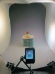
Every piece gets photographed. This actually has to happen before the digital Artwork Archive can be completed, but the photo set-up, the shots, the editing, resizing and organizing will go on with or without that. I have several sizes of light tents, backdrops and lights, but I tend to use the simplest version of everything. Digital cameras and all are so good, I just don’t stress over the photo documentation like I did say ten years ago.


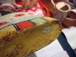
An inventory sticker goes on the bottom of each piece and the whole scene is connected. I will add a separate price sticker sometime in the future, which means I will return to the Studio Log and Artwork Archive. Before pricing,  I usually set out all my work and physically move it around trying to understand goodness, value, artistic merit, improved design, market rates and past sales in a holistic way before I price anything. It’s probably the hardest part.


The upshot of this whole process is I intimately know each of my pieces, start to beyond the finish firing before they fly away into the hands and hearts of my collectors.


-Liz Crain, who, if she had been told ahead of time about the After the Firing ministrations needed, might have not gotten so deep into this clay thing. But then again, it’s pretty much a moot point now, right?


Share this:

Tales of the Workshop: In Which Art and Spirit Meet the Creative Process in a Clay-Collage Mash-up


The Workshop  Art and Spirit led by the venerable Coeleen Kiebert, is a way to access and define one’s creative vocabulary, personal imagery, art-making process and style. Held at her stunning sea-view ceramic studio in Rio Del Mar – which also manages to be intimate and comforting – we found sharing, guidance and time for insights. While I’d taken this course in a longer format over a decade ago, it simply can’t be called a repeat; I am just not the same artist as when I first learned these methods. My goal was to arrive with as few expectations as possible, stay in the moment and tell the truth. Oh, and to circle back around to the intelligent, protective energy that Coeleen provides. What a week!

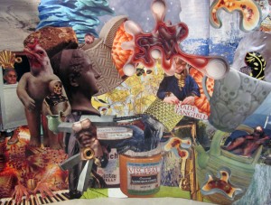
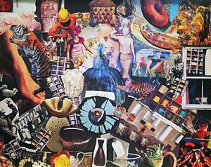
Day One: Re-steeping myself in Coeleen’s descriptive creative process and beginning again with the making of a found imagery collage on a huge 18×24 paper support. We are silent and it takes hours finding the pictures and words to select, where to place and interrelate each piece.  The collage-making proved intuitive and I did not over-think it.  Coeleen suggested we pause and look for evidence of the four elements in our imagery and colors.  I found tons of Earth (natch), reasonable amounts of Fire and Water, but almost NO Air. When the seabreeze kept lifting my unattached piles of papers and blowing them upside down and into different arrangements, I decided that Air was playfully present and I did not need to try to represent it with imagery. I dreamt of my images that night and returned in the morning to attach the last ones before we gathered to share and respond.


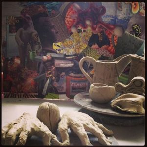
Day Two: Collage completed,  Coeleen introduces The Map, a conceptual grid of thirds which aids in interpreting our images by where in the rectangle they have been placed. The grid includes a continuum from unconscious to conscious, higher and lower realms, fears, undeveloped concepts, dreams, outward and inward movements, archetypal and Shadow areas.  What images and colors did I repeat or put in prominent positions? What meanings can I pull from them, literal, analogic and metaphoric? These represent a language I think in: a glimpse of my image vocabulary. She suggested we pick three images and fashion them in clay,  recommending that one of them be an image we don’t quite understand or are disturbed by.  I started with the piano-playing hands and the seed image from the lower left, then went to the straight-forward ceramic pitcher, the vessel near the center.  Side pieces appeared, but it was great to work with clay independently of needing it to have any sort of outcome: just be there and be attentive and responsive to what comes up. I could not decide on a third piece, but slept on it.


Day Three: In the morning I quickly made two clay pieces from collage imagery I did not understand. They were curvilinear and abstract,  and I wound up liking both really well, even if I still didn’t quite get them.


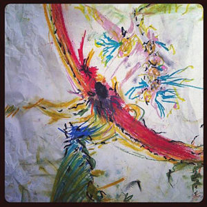
In the late morning Coeleen guides us to The Doodle as way to access a personal style. We have a few warm-up doodles and we’re off for an uninterrupted time, moving the oil pastels silently and goal-lessly over the page however we like. And, yes, it IS touchy-feely in just the right way: a supremely visceral and kinesthetic experience for me. Outcome is not important, but I do find myself wondering what the page “needs” to express itself: Another color? Another series of marks in this corner? It was a dialogue. We hung our doodles next to our collages and began to notice similarities of colors and patterns,  the division of space, the energy expressed. The collage and doodle processes are so different, and yet the results are clearly cousins!


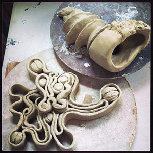
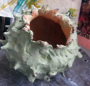
Day Four: Time to doodle with the clay!  Grab a grapefruit-sized lump of clay, work with eyes closeddoodling in 3D for at least 15-20 minutes, open your eyes and continue working.  Out came this giganto spiky pod thing! What is similar here to my previous collage and doodle imagery? What has evolved? Insights? I’m beginning to think I enjoy seed pods and potential growth more than I thought I did.


Day Five: This last day is dedicated to refining the clay pieces and making one last foray into something we each wanted to understand better. I found myself making another collage. In this one I specifically was asking to understand what the concept of vessel means to me. The night before I had looked up all the meanings of the word, so I let myself find the right imagery for ships and veins and containers, even metaphoric ones as in, “He was a vessel of the Lord.”  I placed the new collage next to the old one, with my doodles and clay work alongside. I find only a few connections, and only the ones I had intentionally put there; I’m spent.  But the other workshop folks pointed to one similarity after another, the unity being obvious to them. And obviously I have tons more to apprehend, which I take as a Very Good Thing.


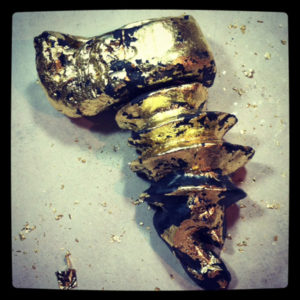
Coda: I took my wet clay pieces home,  finished and fired several.  The one I still don’t quite understand – the screw-like piece taken from the first collage – got a coat of black underglaze and after firing it,  I covered it unevenly with thin gold leaf. The aim is to have it look more like the mysterious gold object (originally an artifact in a National Geographic.) It’s hanging on the wall a glance away, just to the upper left of my monitor, the spot on The Map where dreams reside.


– Liz Crain, who is so happy to be working this way again, she signed on for six more weeks at Coeleen’s studio starting in late October!


Share this:

Thistlethwaite and Haste: Failure as a Metaphor for Success


While I’m busy making other plans for aesthetic awesomeness and cultural dominance,  clay unfailingly reminds me to cleave to patience and humility. To aim high, show up in the studio, stay the course and remain grateful for it all: those bedrock opportunities for excellence.

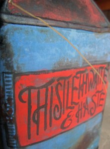
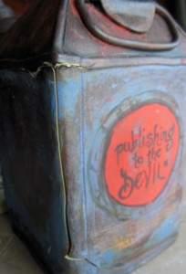
The piece pictured above, the thoroughly cracked Thistlethwaite and Haste, has given me once again an ironically humorous lesson I guess I am doomed to repeat to the extent that I become happy about it.

This re-decorating and re-firing should have been a slam-dunk. I was just adding a fillip or two to a relatively plain piece from last year. It’s something I have done successfully many, many times before, whether as a subtle touch-up or a complete re-do.

Because an important part of my new artistic direction is to make my own brands, logos, slogans and tag lines, I delved deep on the design details and the painting, set it in the kiln, fired it to a ridiculously low temperature compared to where it had already gone…and… opened the lid to an unequivocal failure.

As best as I can figure, there were stresses hiding in the clay. Where, how and why are perhaps unknowable. Maybe they were always there. Was it due to forming issues? (But why didn’t they show up at the first higher temp firing?)  Was it between the tensions of inner and outer surface treatments? (Hmmmm.) The relative speed of the kiln temperature changes? What? While it is good to suss out the reasons for problems, sometimes – OK, often – they just are the way they are…Shrug and go on.

Yet, yet…..The meaning of that title…..

Was there Haste involved? Impatience?  Imperiousness? Maybe.

The clay and the kiln both replied: Thistlethwaite.

Sigh. It’s almost a Jungian dream message.


And there’s more!

Here’s the back.


More evil sproing cracks and that tag line: publishing to the DEVIL.  To do so is to reveal your fond intentions to the wrong person or at the wrong time. Wait, could that mean me? I’ll take it as a kicker, for I think the kiln genie was definitely out dancing with the ghost in the machine this time around.

I will certainly remake this piece in some fashion, maybe a bit more intentionally, with love and laughter. Its ironic title and all the extras I added around the sides make me chuckle, even with those cracks. And that is exactly the Success part of this Failure I am most happy about.

–Liz Crain, who realizes that speaking of all this here may or may not help the Devil calm down and just go along with her plans.

Share this:

My Backlist, A Self-Retrospective Part II: Early Surfaces

Yogi Berra said, “You’ve got to be very careful if you don’t know where you’re going, because you might not get there.” That sums up my early years in ceramics, both with forming the clay and most definitely with the glazing and decorating of it. Even so, when I look back, there are hints of a direction, or at least a pretty persistent search for one.

If I thought forming clay to match my ideas was difficult...(and I did; see last post.)

If I struggled with finding the best timing to shape, attach, carve or walk away from the clay….(Yes.)

If I never was quite certain if I was making it or if it was making me….(both, really.)

Well…. let me just aver, utterly, soberly and whole-heartedly: Those consternations were NOTHING, nothing at all, compared to learning how to choose and apply fireable finishes.

To my credit, I tried every method that came my way: high-fire, mid-fire, low-fire glazes. Stains, oxides, washes. Powders, pencils, chalks. Raku, pit, barrel and saggar firings. Resists, erosions, bas relief, sprigging. Colored pencils, acrylics, inks, gold leaf. Decals, china paints, lusters. Punk, Zen, Classic, Primitif.

It might be a touch purist and it certainly is a point of pride, but I believe in the completely fired surface. I’m not beyond adding “cold finishes,” but my search has always been to go as far as I’m able with the clay, the ceramic decorating materials and the heatwork of the kiln.

What follows are a selected group of forays into my early surface decorations. I purposely left out the traditional Cone 10 Reduction work because for me it has turned out to be either a default placeholder or a jumping off point for what I really found interesting: Color and the dryer surface.


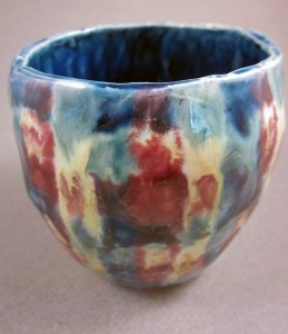
Using Three Glazes to Make Plaid, 2002

Here I am getting fancy with lowfire glaze application. If you’ve done anything similar you know glazes chemically react to each other in surprising ways while melting and moving with gravity. This Three Glazes Making a Plaid was probably my most interesting semi-intentional effect. It was basically an over/under triad test tile without me knowing what that was. Yes, the blue and yellow made a sort of green, but I did not expect so much movement on the vertical surface and was lukewarm about the result.  I moved on to the less-flowing colorful underglazes which were definitely more WYSIWYG.


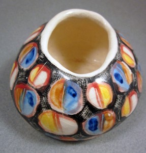
Bright Circles with Hatchmarks 2003

This was more like it! Created during a short two-week Surface Decorating workshop, here’s a simple flattened pinch pot shape which continues the idea of primary color layerings in the previous glazed piece. It benefits from not too much movement in the underglazes AND some bold crosshatched scratches through the wet application. It’s an example of holding gold in your hands and not knowing how to follow it up with any meaningful variations. I may just have to replicate this effect now.

It’s common for academic programs to emphasize Cone 10 reduction glazes and firings and downplay working outside that format. My detailed, colorful and Cone 6 oxidation fascinations met with little support in regular classroom assignments and I did not return to them for two more years.


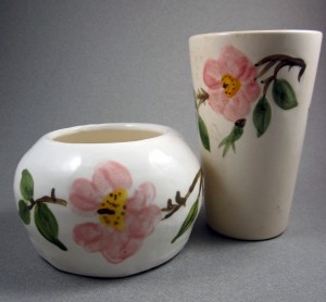
Copying Desert Rose (on left) 2003

But one fun thing before we continue:  Once I learned that Duncan Concepts and Mayco Stroke ‘n’ Coat underglazes applied and mixed similarly to paints, I hacked my Franciscan Desert Rose china pattern.  I know exactly the colors to use should I ever want to be a commercial china pattern “paintress.” May have to revisit this one as well.


Sgraffito and Painted Vase 2004

In an attempt to replicate the linearity of drawing AND the dry-brushed watercolor/colored pencil subtleties I had managed in my previous 2D work, I tried a sgraffito technique which resembled old hand-tinted woodcuts. The piece was covered with black engobe at leatherhard, then carved when it set up. After bisque firing,  thin washes of non-shiny underglazes were applied. They seemed to film up the black, which I needed to restate. It got complicated, but there were vast possibilities here. It let me draw, added lovely directional textures and also let me add color without resorting to too much muddying flow or unsubtle brightness.


Isadora Series 2005


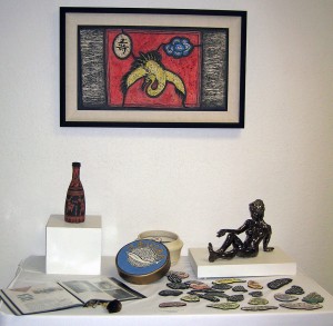
It’s good to have skills, but what to do with them? Above are four pieces related to the dancer Isadora Duncan, three of the four using the dry finish colorized sgraffito technique.  These works culminate a certain era in my Backlist Story, so we’ll wind it up with them.

It was gratifying to work from the concept end of clay creating, choosing the forming and finishing techniques I’d enjoyed the most in the service of a Big Idea. They sprang from four separate semester assignments which I knit together around  my theme. They were to make 1. A Hood Ornament 2. A Surprise Box – something which looked different from what it contained, 3. A Portrait of a Loved one, whether representational or symbolic and 4. A Place Setting for the Feast of Dreams, which could be a metaphor.

Here are some closer looks

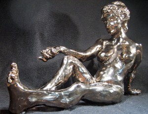
Isadora Duncan Hood Ornament 2005

Based on a photo of the dancer, and modeled fairly solidly and then hollowed out and glazed with a bronze metallic glaze (who said I didn’t like shiny?), this would be a completely classical over-the-top hood ornament for my Art Car!


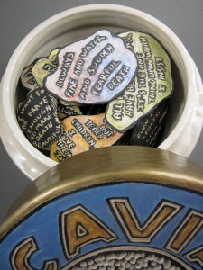
Surprise Over-sized Caviar Tin with Quotation Clouds 2005

Here’s a humongous (over 12″ in diameter) caviar tin replica – Isadora loved caviar! – full of sgraffito’d and painted quotations (and she was supremely quotable.)


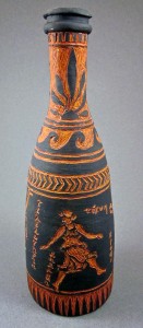
Greek Vase Style Champagne Bottle 2005

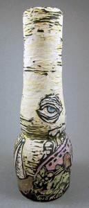
A champagne bottle “portrait” – Isadora loved champagne! – based on drawings of the dancer, done in Greek vase red figure style.  Finding just the right classic Greek vase red was a challenge! But I had a Greek fellow student who helped me with the inscriptions.


Isadora’s Scarf Mosaic 2005

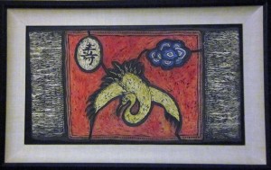
A metaphoric Feast of Dreams place-setting in sgraffito mosaic, mounted and framed. It is based on a description of the six foot long  -with 18″ fringe –  silk batik scarf that Isadora was wearing when it wrapped around the axle of the car she was riding in and strangled her. Dramatic to the end. Let the scarf be the picnic cloth for the hereafter.

And creatively speaking, the Isadora series opened up my personal voice, in not only forming and decorating methods, but in subject matter. Ever after, the work has demanded my personal involvement in the meaning of it as well as the making. At least I know THAT much about where I’m going!

~Liz Crain, who once had an art advisor critique her work by saying, “So you can paint! What now? What will you say with it?” It was so amusingly and lovingly said, it has stuck with her as a purposeful guide.


Share this:

My Backlist, A Self-Retrospective Part I: Early Forms

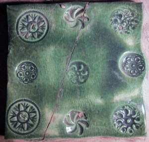
Second Grade Button Tile

The Art Teacher handed out a damp clay squares and baskets of buttons and said to press them in any way we liked.  I remember doing this: My seven-year-old mind was trying for a certain symmetry and, as you can see,  almost achieved it. I remember liking the simple pinwheel button the best (still do) and I remember writing my initials – E.A.H. –  into the wet back.  The finished tile re-appeared with this green glaze and I’ve had  it ever since.

Fast forward to clay work decades later.  Let’s look at a handful my earliest pieces and see what I remember about making them and what I see now with applied retrospective understanding.


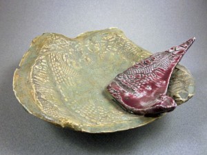
Off-handed Soft Slab Dish with Shard, 1999


This footed soft slab textured dish shows a generous willingness to let the clay be clay, but not much finishing technique. The edges and that point are really sharp! And the piece rocks on its foot. I made four similar pieces, cutting the imprinted slabs with a sideswipe of a rubber spatula. My painter’s experience chose nearly-complementary colors for the glazes, as well as contrasting matte and shiny finishes.  I see that my attraction to duller/matte surfaces appeared at the beginning, even if I felt so utterly out of control that I let the materials direct me. (Which was not so bad of a choice as it sounds!)

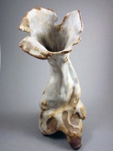
Free Form Vase With Legs, 2001

Another matte and soft-formed piece, done “After Instruction.”  I still worked very wet, following the clay’s lead – and gravity’s – and did almost no adjusting,  clean-up or finishing work,  although the edges don’t bite and it sits steadily on its three legs.  I enjoy the organic expanding gesture of this vase and the dull white stoneware glaze with the iron oxide “burnt” areas. Flowers look wonderful in it and it doesn’t leak. I still like to make my taller vase-like pieces dance!

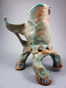
Walking Winged Mug, 2001

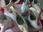
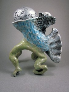
More legs! I see this Mug/Cup beginning to have real stance and gesture. The Handle-Wing is very comfortable to hold but the crudely applied leg attachments are cracking off and that one on the far right shrunk and pulled up out of the plane of the other three legs in the heatwork of the kiln. The top rim is so uneven as to not deliver beverages to the lips without dribbling. Definitely a concept piece. Love that turquoise matte glaze which is toasty where thin! I was tiring of only glazing my work and hungry for more painterly surfaces, but hadn’t a clue on how to obtain them and was flummoxed by how radically it all changed in the kiln.

Precariously Balanced Cone Vase, 2001

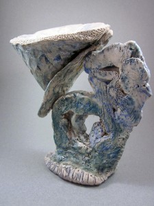
A radical attempt at pushing the sculptural vessel envelope in 12″ tall concept goblet which is more about form than function and proud of it. I was still letting the clay be its lumpy self, and attaching things by glazing them together. That cone shape is barely touching the flattened support and I don’t quite know how it stayed in place. I see some poked in stippling texture at the rim and a lot of drawing with underglaze chalks and pencils before sponging on the clear glaze. A daring piece which I could have never replicated….and really didn’t want to, but I was getting away from relying on glazes at last.

Quadrupedal Zoomorph Rattlehead Prototype, 2003

A few years later, I’ve got some command of my forms….up to a point. I still work the clay when it is too wet, counting myself lucky to fashion the shapes I do before it all dries. The idea of managing and slowing my drying is still exotic to me. Notice the roughly unfinished and caving legs.  By this time I’ve discovered underglazes, especially the Duncan Concepts and Mayco Stroke ‘n’ Coats which have paint-like colors, even if they are too shiny for me. Add the silver ‘cold finish’ Rub ‘n’ Buff colored wax and you’ve got “It Came From the Sea.”  This was the seminal piece for a series of 20 I developed, all on legs, all with improbable animal bodies and round hollow rattle stoppers. I called them QZRs, for Quadrupedal Zoomorphic Rattleheads. They were heavy and crudely finished, but full of heart and intention and love of the medium…and they were my original invention.

What I’m taking away from these very early pieces is an appreciation for my willingness to mess around and see what happened and then make some aesthetic decisions. That investigative spirit led me to repeatedly try nearly every technique for forming and finishing I encountered, as many times as they were presented. I read avidly, clipped articles, took classes and workshops. I often heard the same instruction and explanations with new ears and a new mind, full of wonder each time. I made all kinds of errors. I learned to throw and found I was faster working by hand and that I tended to alter my thrown pieces so completely it was pointless to start with something perfectly round. I had a decided preference for sculptural over functional, narrative over reporting.

I still persisted in working the clay too wet and then letting it get away from me, though. I did not learn for at least another five years how to maintain dampness, selectively re-wet, do the right moves at the relatively optimum state of dryness, work in pieces and attach them or how to reclaim totally dried out clay. That did not really stand in my way because I was fascinated with the work at hand and there was always plenty to learn about that. Even now, the spirit of exploration accompanies me as a permanent partner in creativity.

I also see a sense of humor in these forms, a certain verve or brio that I never want to lose. It’s good to look back and intentionally catch and preserve what matters in the long arc.

Part II will expand on my early adventures in surface decorating.

~Liz Crain is a ceramic artist and has been for longer than she thought.

Share this:

Commissions Are Like Picking Scabs


Of course I know better. It will just re-open the wound and make it worse. Maybe leave a scar.

And there I am doing it again: saying yes to a commission proposal, when I swore them off.

I’ve had some gratifying commissions in the past. The requesters are enthusiastic fans, wanting something special from my hands. Perhaps it’s a personalized beer can for a daughter-in-law, or matching tobacco cans for a family to commemorate a father, or an oil can with pour spout inscribed to honor a motorhead buddy. I treasure that they are nearly always special gifts for a loved one.

The collectors describe their idea, maybe they even come for a studio visit. We email, we exchange images. I make a sketch. We email again. Eventually we settle on IT. I name my price. A deposit is made and then….

I’m in trouble. (Actually, I was in trouble at the outset.) And it’s all my own doing. With a number of commission successes behind me, what could be the matter? I wasn’t sure until I started asking around.

Exactly NONE of the artists I’ve queried are enthusiastic about commissions. If they say yes it’s often against their better inclinations and usually for one of two reasons:

1. They believe they need the love, money, fame or doors opened.  Or,  2. They don’t know how to say no.

Or both.

I do both. The money, fame, or open doors don’t usually motivate me, but offer love (appreciation) and  I’m  Just a Girl That Cain’t Say No.

Am I that much of a needy pushover? Naw, I think I’m just unskilled and unpracticed. After a decade of saying yes to everything, I’m now learning that not every opportunity is MY opportunity. (Thank you coach Cynthia Morris for this concept.) My spheres of creativity, my pursuits, my priorities have shifted, taking my studio rhythms with them.

Sometimes the right words come along in the moment as in, “Let me think about it.” But more often it’s a version of “I’d love to, thanks for thinking of me” and right where I should insert the lovely ironclad refusal….. I say OK and am all in. Oops, I did it again.

I need a Ten-Second Elevator Regrets Speech to parrot. I have Justine Musk’s crazy sarcastic list, It would cause the slow withering death of my soul ” + 75 other ways to say No, which is definitely good for Creative Badass laughs,  but it still won’t get me the phrase I need:  the pleasant, clear-eyed refusal that leaves the asker not feeling sorry they asked in the first place and me with my studio schedule intact. Still Friends.

Just what IS the rub about commission work? Most times the problem is not the patron, or even the commission concept — although I have experienced disasters with both — it’s that the art-making is for someone else from the get-go. And immediately the choo-choo train of creative process needs a giant cowcatcher strapped on the front to fend off the extra assortment of expectations, assumptions, explanations, interpretations and arbitrary agendas. The presence of the patron never really leaves.

I thought the pains I felt over commission work, the procrastination, the pique, the self-doubt, were just me being temperamental. But other artists tell me of similar thoughts and feelings.  So it’s with glad relief that I’m reading Jonathan Fields’ book Uncertainty: Turning Fear and Doubt into Fuel for Brilliance which defines The Rub. He says free-range creativity takes a huge hit when it is subjected to expected evaluation. He speaks of the the differences between intrinsic (soul) work and extrinsic (paid) work as motivators, with the intrinsic work being more venturesome in all respects. To back this up, he cites a study by Teresa Amabile of Harvard Business School  in which 23 artists created 20 works each: 10 as commissions and 10 as they wished. The artists did not know this, but afterwards all the works were put in front of a panel of artistic experts — museum curators, art historians, gallerists and the like — to evaluate for creativity and technical excellence. While they found no separation between any of the works in technical excellence, the commissioned works were rated as significantly less creative than the non-commissioned works.” Significantly!

It’s starting to seem obvious. “When you know better, you do better.” (Maya Angelou) For the good of all — me, them and my best artwork —  I need to put a bandage over my automatic-yes-to-commissions habit and let it all heal.

~Liz Crain, who enjoys the fact that even the venerable late Victor Spinski once got so irritated at a collector’s request for amendments to his work, he took the piece – a trompe l’oeil garbage can – put it out with his regular garbage and photographed the garbage collector’s surprise at breaking it. She’d like to have overheard his explanation to the collector as he returned the money.


Share this: