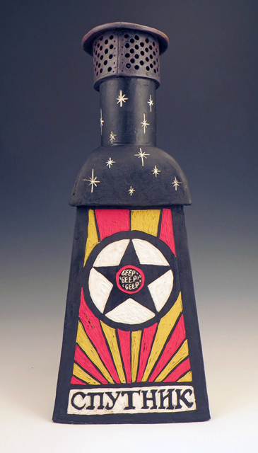
What do you get when you cross a hand-built ceramic incinerator sculpture with Sputnik-era Soviet propoganda-style graphics featuring Cyrillic lettering?
Give up?
I don’t know either, but let’s poke at it and find out.
I do know it’s the first foray into a new way with clay for me. More sculptural, with exploratory narrative and different surface technique than the work I have done for the past several years.
Specifically, you’re looking at the backside of my piece currently on display at the Pajaro Valley Arts Gallery HOME Exhibit. The side you can’t see if you’re standing in front of it. So here’s your special viewing.
I wrote earlier about the inspiration and the research for the whole piece, titled Homefire 1957, and you might be wanting to read those snippets as background, but right now I just want to look at this one side as a standalone.
Basically this face of the four-sided work represents Soviet gloating over beating the USA in launching an artificial satellite into space. The Cyrillic letters spell “Sputnik,” the name they gave that 23″ silver ball with the four long antennae that they propelled into low earth orbit on October 4, 1957.
The bold poster-y look is in the style of a long line of 20th Century design that began with Soviet Constructivism. Over the decades, it tumbled through Futurism, Suprematism, Bauhaus, DeStijl, Dada, Productivism, Eccentrism, and, inevitably, Deconstructivism. Regardless of the moniker, a common plank in the platform of each holds a public propaganda ortho-message: Things will look this way in these colors and with these lines and layouts. If one wants to evoke a Soviet-era anything, one will find these shapes and these colors, these letterforms, these graphics. The ortho-message endures.
In the middle of the star is the gloating and taunting: Beep Beep Beep. For not only could Sputnik be seen with the naked eye at dawn and dusk as it circled the globe every 96 minutes, it could be heard.
Sputnik was tracked by everyone, world governments to ham radio operators. Which meant that everyone for the three weeks it transmitted its radio signal – until its batteries died – could tune in to the incessant Beep Beep Beep and rebroadcast it over the commercial airwaves. It might as well have been Nyah, Nyah, Nyah to the American Space Program which was caught flatfooted and lagged behind for years after that first coup.
As far as ceramic technique, most of the piece was painted with black underglaze while still damp, the designs transferred and then shallowly carved to remove the thin black layer. It feels a little like wood or lino carving, but it does not involve inking and printing. It is called “sgraffito“ which is Italian for a scratching technique. After the bisque firing the rest of the underglaze colors are painted on. It’s a technique I have tried many times over the years, and loved, but never found my stride with. I’m feelin’ it now, though, and have plans for more, more, more.
–Liz Crain, who wonders if you know that it was the SF Chronicle columnist Herb Caen who coined the portmanteau “beatnik” on April 2, 1958 in his article about the Beat Generation. And the Beats hated it.
Links for Posts About the HOME Exhibit and My Piece in It
“Homefire 1957” Sculpture
- Between Two Fires – An overview of the finished work, including photos of it.
- R&D for Homefire 1957 – A look at the information and image-gathering that went into this piece.
“HOME” Exhibit
- Bringing it All Home – Delivering the piece to the exhibit.
- In Which I Find My Art Reception Mojo – Some tips on feeling at home at art receptions
Exhibit Details: “HOME” Member’s Exhibit 2016, July 6 – August 7, 2016, Pajaro Valley Arts Gallery, 37 Sudden St., Watsonville, CA