Why for sanity’s sake would a professional ceramic artist take a Graphic Design class? As the semester winds down and I see what I have – and sadly have not – learned for my time and angst, I am asking myself that. My desired takeaway – design layout skills which I could translate to the surface decoration of my cans – seemed straightforward enough, but I was woefully blindsided by my cluelessness of what would be involved to get there.
I never suspected, for example, that modern Graphic Design is probably one of the most anally perfectionistic, entirely digital, exceedingly clean and non-tactile experiences possible. And I say that with love and respect, but, seriously Nope, Nope, Nope, it is not even a little bit like my messy, organic, directly malleable clay studio.
Humbled and schooled within the first few weeks, my learning curve inched glacially, sagged and threatened to flatline. I understood the concepts, had plenty of ideas, but I could not deliver on the execution with any ease or finesse. OK, I couldn’t do it at all, even horribly! I nearly cashed it in right before my more-important-to-me annual Open Studio weekend.
Major challenges:
- The massive Adobe InDesign program, which I sat in front of initially dumbfounded. All the workspace buttons looked alike. I clicked and found myself in Strange Loops. The only thing I commanded was Command Z (Control Z if you’re using a PC. See next challenge.)
- Irreconcilable differences between my home PC and the school’s Macs, which rendered any finished work done in the peace of home unreadable in the classroom. The workaround was awkward, too.
- Time/Concentration constraints: Those looming due dates! Class work time truncated by lectures/demos/critique days. Limited one-on-one access to the instructor because of the understandable educational needs of 24 other students. (The creative process of the two young men I sat between also included chortling to themselves and singing along with their music.)
- The comparative confidence and facility of those other 24 whippersnappers. How quick, how eloquent, how fearless they all seemed. I felt my learner’s vulnerability issues go from neurotically cute to stultifyingly shame-filled, which wears especially hard if one is used to feeling pretty darn competent in most other ways.
What turned it around?
- I worked on my suckitude feels. Little Miss Easy A needed to lose the comparisons and self-judgment. Start Where You Are, Be Here Now, Accept Reality and all that other Buddhist compost peppered with self-deprecating black humor did the trick.
- Personally subscribing to InDesign CC 2015 in order to learn/work at home and to maximize my self-sufficiency in class. I bought the ID “Classroom in a Book.” watched scores of YouTube ID tutorials, researched the specific problems I encountered – problems so simple the answers often over-explained, creating new problems. Miracles abounded though, and the IDworkspace became meaningful.
- I asked for help! Case in point: After I humbly begged him, my son graciously put my Assignment 2 designs – which unfortunately were due the day after my dangerously-close-to-flatlining week/Open Studios weekend – into the right file formats. He said he thought it was borderline cheating, but he would do it only if I promised to recreate the assignment on my own later. I said thank you and told him that he would make a tough but fair parent. He replied he learned from the best. Touché! (And yes, I did what I promised him.)
- I learned to simplify my ideas regarding each assignment’s parameters in order to be able to pull them off but to still fulfill my aesthetic needs for work that was interesting, humorous and unique to my point of view. Crucial for dignity!
- I learned to maximize the face time I had with my wonderful instructor. I tried not to monopolize him, even though I wanted to. but he was adept at scooting away. I came to class ready, with my ideas thought through and my questions written. He gave critical suggestions, showed me alternatives. He gave me no quarter just because I was such a woeful nube. I watched his hands as he manipulated my work onscreen and explained his thinking and I stopped him for explanation every time it seemed like a magic trick.
Outcomes:
- Adobe InDesign is a tool. Yes, I have lots more repetition and skills-scaffolding ahead of me, but I see where it fits into my studio practice now.
- Graphic Design can be tactile: space, text, headlines and illustrations, especially space! are alive in my mind. I swear, when working on my last assignment, I sensed the subtle sensation of sculpting the elements on the screen through the keyboard, the tactility neuron pathways firing in new ways.
- I have augmented my package design skills with refinements to the language of pattern, shape, and the shapes around the shapes along with the meanings they infer as visual art.
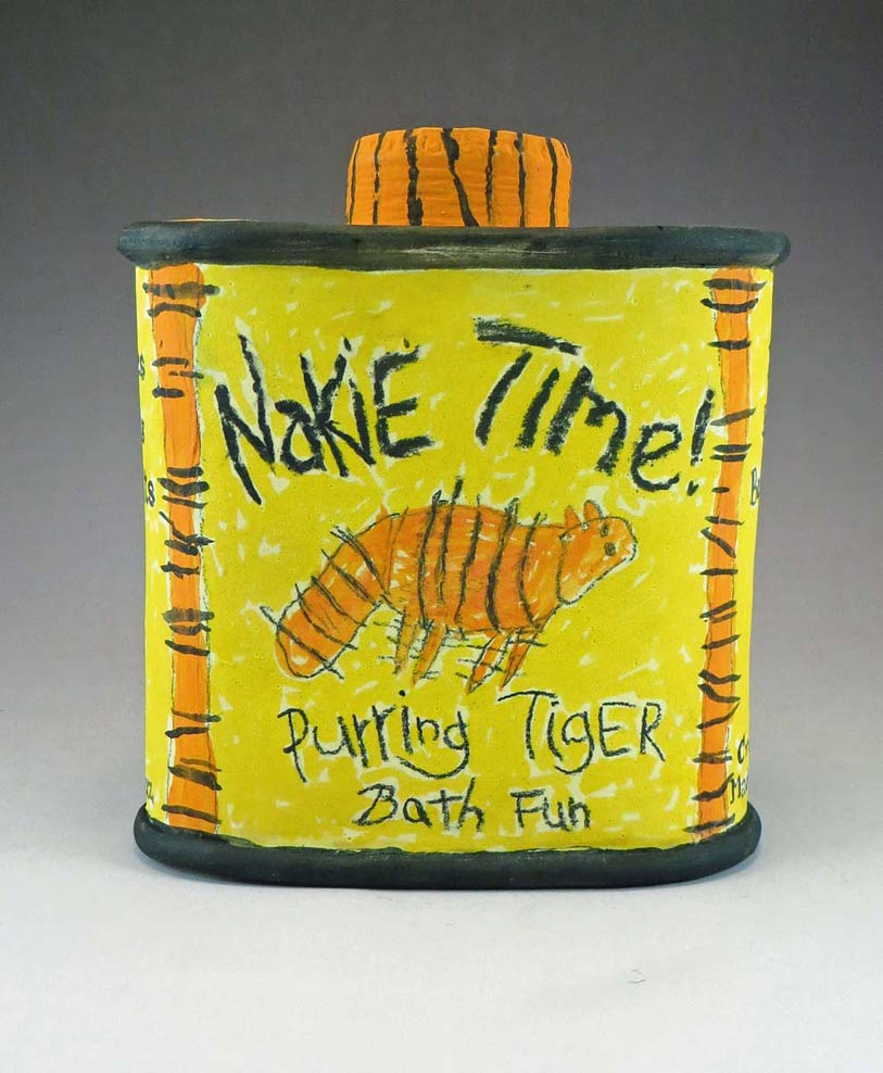
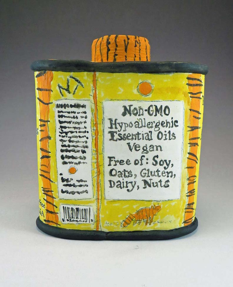
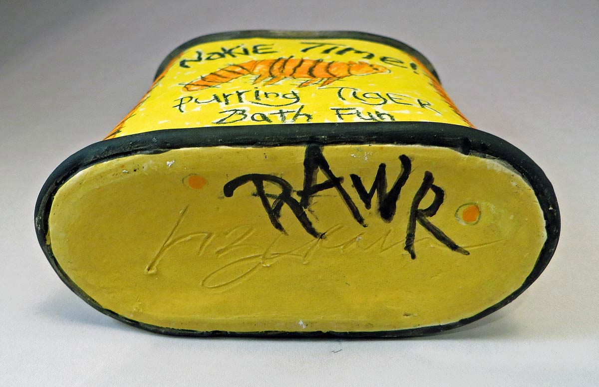
- The final project integrating my ceramics and graphic design worlds: Nakie Time! Purring Tiger Bath Fun Canister, seen at the top. Here are a few other views:
BACK:

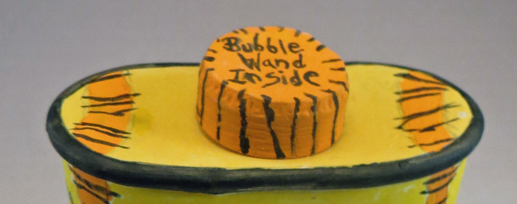
TOP: (and yes, there really is a plastic bubble wand inside.)

–Liz Crain, who is as happy as a purring tiger to have survived, nay, prevailed with pertinacity! in her Graphics Design class. RAWR!
