Actually, Guestbook, is the wrong name for it. To me Guestbook implies a memory book with poignant comments left by a clutch of visitors. Historical. Reception-y. Funereal.
And, if a simple listing of visitors and their comments is not the main goal, how to make sure the thing does what it’s supposed to do? I think I know!
What I want is not a comment-collecting cul-de-sac, but a conveyance. An invitation to stay in touch. A conversation-starter. (And thank you to Alyson Stanfield, the Art Biz Coach, for insisting again and again that one’s hard-gathered mailing list is utterly unique and to be cherished. Even though I did not fully understand at the time, I heard and remembered.)
Any format that does not foster continued interaction defeats that core purpose of continuity.
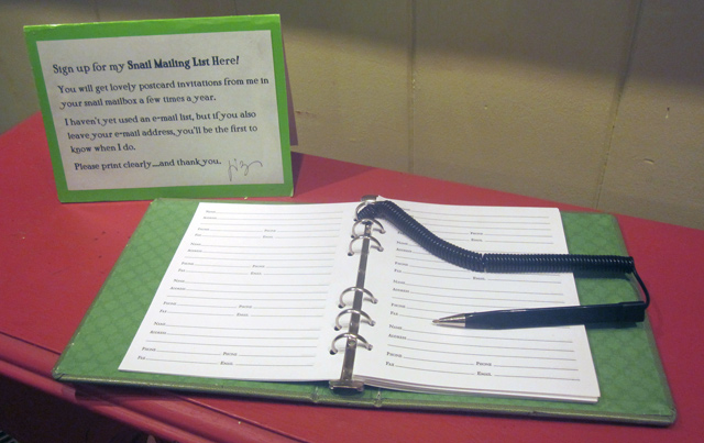
So, take a look at my former Guestbook-style set-up. (Even though I was calling it a Mailing List.)

Here’s what I knew to be dysfunctional about it:
- Clunky and chunky
- Hard to write in
- Pages got skipped
- Entries public to other visitors
- Yawn-worthy format, even in lime green
- Footprint too big for a crowded reception table, especially in a 10×10 booth
- Required a separate explanation/call-to-action tent card behind it
- Did not ask for the info I truly needed (PHONE? FAX? Hell no…)
- Insufficient mention of what signer would receive
- No assurance of privacy regarding collected info
- Spacing and length of pre-printed lines encouraged unreadable writing, dooming the entire exchange.
Geez, when I list all these impediments now, I wonder what took me so long to work on a solution. Truth is, I had no ideas for improvement. Yes, I’ve done the clipboard thing, the raffle-ticket-as-mailing-list thing, the leave-your-card thing. I even considered an electronic self-entry system (which may still be in the future.) But until last month this old-school Guestbook format was the bestest I had come up with.
Until it wasn’t.
With these drawbacks in mind, I searched, hoping to discover some elegant solution which would:
- Sport a smaller footprint
- Be easy to use
- Be artfully appealing
- Be discreet
- Let folks know what to expect
- Foster readable entries
- Be affordable right now
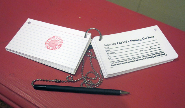
And I discovered just that! What I happily ran into were ready-made hole-punched, separating-ring-attached 3″x 5″ card systems designed for students memorizing facts or similar. I brought a few home and played with the concept. How to set up… How to attach a pen…How it felt…
It looked promising. I designed and ordered a custom 2″x 4″ stamp. I stamped 100 cards with the main stamp and a decorative one in less than half an hour. All set. And that’s what you see at the top of this post: my new way for folks to sign-in and sign-up.
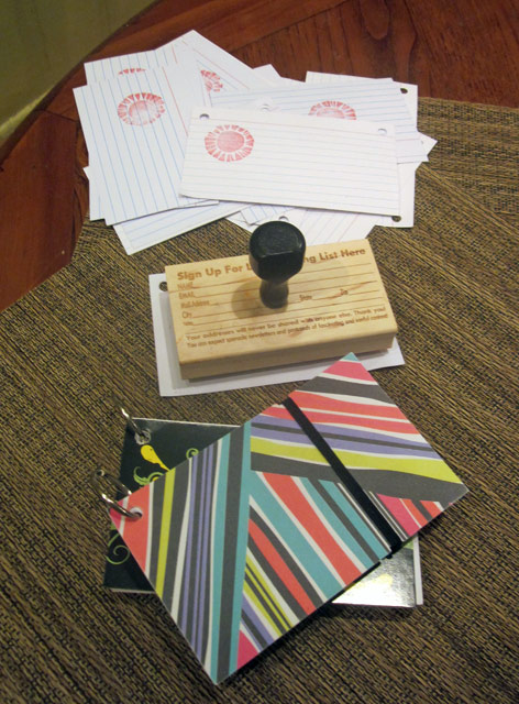
I first tried them out at a busy weekend festival and not one of them was unreadable. Ahhh! Conversation-starters, indeed. Here’s a group shot of the commercial packs that gave me the idea, the stamp I ordered and the pile of completed cards already entered into my snail mail and email lists, according to the lovely legible info written on them.

I’m never going back. Besides being unique, discreet, clearer, cheaper, sassier, and legible, I can fit THREE of these in the same tabletop footprint of the old Guestbook, meaning I can easily scatter them around my booth/gallery environment, ready to receive and help me and my fans stay in touch.
–Liz Crain, who’s decided that when she makes more, she will use blank 3x5s, punch the holes herself, add a stamp or two, and make covers featuring her art. She welcomes you to try this for yourself!