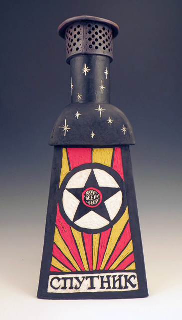
What do you get when you cross a hand-built ceramic incinerator sculpture with Sputnik-era Soviet propoganda-style graphics featuring Cyrillic lettering?
Give up?
I don’t know either, but let’s poke at it and find out.
What do you get when you cross a hand-built ceramic incinerator sculpture with Sputnik-era Soviet propoganda-style graphics featuring Cyrillic lettering?
Give up?
I don’t know either, but let’s poke at it and find out.
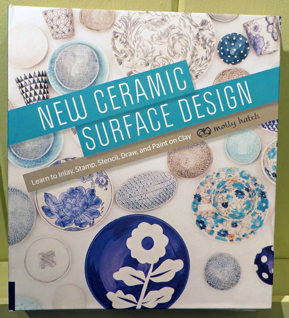
Dear Molly,
Thank you for making the book New Ceramic Surface Design. It’s a corker and I am keeping it out for easy reference.
While I own a couple other treasured surface design books (Robin Hopper’s Making Marks and The New Ceramic Surface by Mattias Ostermann,) I have never read them cover to cover, penciling notes in the margins and flagging whole sections, like I have yours.
I know nothing you cover is a really new technique. Believe me, I have tried mishima, stamping, textures, doodles, resists, stencils and my favorite, sgraffito, many times before. I have watched DVDs, taken classes and explored the surface design chapters in many other books over the years. So what’s different and valuable about yours?
Here, I’ll tell you:
What I really can’t wait to use:
It pretty much all comes down to you being the generous and knowledgeable “friend with a good eye” you speak of on page 34.
Gratefully yours,
–Liz Crain, who also thinks the spiral binding is a nice touch so this reference book and be fully referenced.
Yogi Berra said, “You’ve got to be very careful if you don’t know where you’re going, because you might not get there.” That sums up my early years in ceramics, both with forming the clay and most definitely with the glazing and decorating of it. Even so, when I look back, there are hints of a direction, or at least a pretty persistent search for one.
If I thought forming clay to match my ideas was difficult...(and I did; see last post.)
If I struggled with finding the best timing to shape, attach, carve or walk away from the clay….(Yes.)
If I never was quite certain if I was making it or if it was making me….(both, really.)
Well…. let me just aver, utterly, soberly and whole-heartedly: Those consternations were NOTHING, nothing at all, compared to learning how to choose and apply fireable finishes.
To my credit, I tried every method that came my way: high-fire, mid-fire, low-fire glazes. Stains, oxides, washes. Powders, pencils, chalks. Raku, pit, barrel and saggar firings. Resists, erosions, bas relief, sprigging. Colored pencils, acrylics, inks, gold leaf. Decals, china paints, lusters. Punk, Zen, Classic, Primitif.
It might be a touch purist and it certainly is a point of pride, but I believe in the completely fired surface. I’m not beyond adding “cold finishes,” but my search has always been to go as far as I’m able with the clay, the ceramic decorating materials and the heatwork of the kiln.
What follows are a selected group of forays into my early surface decorations. I purposely left out the traditional Cone 10 Reduction work because for me it has turned out to be either a default placeholder or a jumping off point for what I really found interesting: Color and the dryer surface.

Here I am getting fancy with lowfire glaze application. If you’ve done anything similar you know glazes chemically react to each other in surprising ways while melting and moving with gravity. This Three Glazes Making a Plaid was probably my most interesting semi-intentional effect. It was basically an over/under triad test tile without me knowing what that was. Yes, the blue and yellow made a sort of green, but I did not expect so much movement on the vertical surface and was lukewarm about the result. I moved on to the less-flowing colorful underglazes which were definitely more WYSIWYG.

This was more like it! Created during a short two-week Surface Decorating workshop, here’s a simple flattened pinch pot shape which continues the idea of primary color layerings in the previous glazed piece. It benefits from not too much movement in the underglazes AND some bold crosshatched scratches through the wet application. It’s an example of holding gold in your hands and not knowing how to follow it up with any meaningful variations. I may just have to replicate this effect now.
It’s common for academic programs to emphasize Cone 10 reduction glazes and firings and downplay working outside that format. My detailed, colorful and Cone 6 oxidation fascinations met with little support in regular classroom assignments and I did not return to them for two more years.

But one fun thing before we continue: Once I learned that Duncan Concepts and Mayco Stroke ‘n’ Coat underglazes applied and mixed similarly to paints, I hacked my Franciscan Desert Rose china pattern. I know exactly the colors to use should I ever want to be a commercial china pattern “paintress.” May have to revisit this one as well.

In an attempt to replicate the linearity of drawing AND the dry-brushed watercolor/colored pencil subtleties I had managed in my previous 2D work, I tried a sgraffito technique which resembled old hand-tinted woodcuts. The piece was covered with black engobe at leatherhard, then carved when it set up. After bisque firing, thin washes of non-shiny underglazes were applied. They seemed to film up the black, which I needed to restate. It got complicated, but there were vast possibilities here. It let me draw, added lovely directional textures and also let me add color without resorting to too much muddying flow or unsubtle brightness.

It’s good to have skills, but what to do with them? Above are four pieces related to the dancer Isadora Duncan, three of the four using the dry finish colorized sgraffito technique. These works culminate a certain era in my Backlist Story, so we’ll wind it up with them.
It was gratifying to work from the concept end of clay creating, choosing the forming and finishing techniques I’d enjoyed the most in the service of a Big Idea. They sprang from four separate semester assignments which I knit together around my theme. They were to make 1. A Hood Ornament 2. A Surprise Box – something which looked different from what it contained, 3. A Portrait of a Loved one, whether representational or symbolic and 4. A Place Setting for the Feast of Dreams, which could be a metaphor.
Here are some closer looks

Based on a photo of the dancer, and modeled fairly solidly and then hollowed out and glazed with a bronze metallic glaze (who said I didn’t like shiny?), this would be a completely classical over-the-top hood ornament for my Art Car!

Here’s a humongous (over 12″ in diameter) caviar tin replica – Isadora loved caviar! – full of sgraffito’d and painted quotations (and she was supremely quotable.)

A champagne bottle “portrait” – Isadora loved champagne! – based on drawings of the dancer, done in Greek vase red figure style. Finding just the right classic Greek vase red was a challenge! But I had a Greek fellow student who helped me with the inscriptions.

A metaphoric Feast of Dreams place-setting in sgraffito mosaic, mounted and framed. It is based on a description of the six foot long -with 18″ fringe – silk batik scarf that Isadora was wearing when it wrapped around the axle of the car she was riding in and strangled her. Dramatic to the end. Let the scarf be the picnic cloth for the hereafter.
And creatively speaking, the Isadora series opened up my personal voice, in not only forming and decorating methods, but in subject matter. Ever after, the work has demanded my personal involvement in the meaning of it as well as the making. At least I know THAT much about where I’m going!
~Liz Crain, who once had an art advisor critique her work by saying, “So you can paint! What now? What will you say with it?” It was so amusingly and lovingly said, it has stuck with her as a purposeful guide.

Today I spent visiting a few other local ceramic artists in their cleaned up, Ready for Prime Time 2012 Santa Cruz County Open Studios Art Tour habitats, gleaning the fruits of the passion we hold in common. Since I hardly get out of my paddock, it was a deliciously freeing promenade and I came home with treasures and photos from most of my stops. Up top you see my new wardrobe of mugs, my personal theme this year. At the end of this post you’ll see the tumbler, bowl, vases and grenade.
What follows are short illustrated vignettes about each these folks…three of whom were participating in Open Studios for the very first time and ALL of whom are open Encore Weekend and of course would be willing to share their work by appointment all year long. (I didn’t ask them, I just know this.)

I had only this one day to get out there, since I participate in this 3-weekend Tour myself and this wasn’t my weekend to be on. I mapped out a strategic travel itinerary like a seasoned Road Warrior for Art. I also announced to associated family and friends I was going it alone. May I recommend that? It makes for agile quality: timing, conversations and all the other decisions: Eat? Pee? See Everything on Every Shelf or Just Enjoy the Overview? It’s my own personal Artist Date, and dang if I ain’t good company to me!!!
The real trick is getting out there as early as possible. Studios are open 11-5; be at the first one as soon after 11 as you can! (But, too early can be awkward.) Happy Hour everywhere is 1-3, so see if you can get to most places before then, or be prepared to swim upstream through the crowds and maybe not have that intimate artist chat. I did the best I could with the timing because I had a 50 mile loop to execute. I only got mildly lost twice, no, three times, the downside of no-one riding Navigator/Shotgun, I guess.
 First stop: Andrea Dana-McCullough, Artist # 265 ( she’s on the left in the photo.) Her love of carving through colored layers onto her pieces (sgraffito) is augmented nicely by her love of insects. I was on a personal quest for a Bug/Beetle Mug, which I found in snappy blue on white. It’s the upper right mug in my lead-off photo. When I got home I washed and began drinking from each vessel in the order I’d acquired it today. Andrea’s was first and I was sorely tempted to just stay put. I have one other piece of hers, a small tray, and these won’t be the last!
 At the farthest reaches of my loop was Travis Adams, Artist # 279. He has the entire back work area and yard of the fabulous Santa Cruz Mountains Art Center STUFFED with his amazing range of work. It was a massive effort and looked wonderful. I had to have one of his grenades – see last photo – and then a dangerously drooly crawl-glazed bowl (also below) caught my eye and a sweet little teadust mug – middle left up top. Travis has also SO generously displayed not only my own OS postcard, but the conetop Travis Beer can I traded him for one of his rat sculptures earlier this year. That’s what he’s holding in the photo. My Tribe…I think I’ll keep them!
 Looking happily occupied with visitors (back to the camera) is Mattie Leeds, who along with wife Melissa, are Artist Studio #289. There is no shortage of things to see here on this Bonny Doon land, the penultimate lifelong ceramic artist habitat. From slightly unbelievable shard-pile mosaic installations, to a formal display room, to the working rooms and kilns, it’s huge and worth the trip. It’s lovely that you can wander the cavernous multi-level inside and outside as long as you like. I didn’t buy a Mattie Mug…I have in the past. Instead we spoke of his recently child-proofed studio (!) and of the piece I REALLY want….
 My heart has an all-or-nothing thing for this big – as in five feet tall – lidded vase which Mattie created as a demo at Cabrillo College. The size and form are phenomenal, but the Asian bird and bamboo painting is even better. Such intimacy and skill on such a huge work! Yep, it’s all I wanted to take home. How? Where? *SIGH*
 Another lovely artist habitat up by the wilds of UCSC and Pogonip is that of Jeannine Niehaus, Artist #240. The yard, the teahouse and her sure-handed thrown and slip-decorated pieces all play well together. Since I have a fall birthday, I was thinking of her bright maple leaf decorations on a little sumpin’ sumpin’….I know….a mug!!!! How about TWO? (Middle right and back in the top photo.) Jeannine never stopped long enough to pose; her yard was full of aficionados. (I waited until they briefly cleared from her teahouse deck to take this shot.) She was cheerfully watering her bedding plants and chatting the while and setting a fine example of how to genuinely represent.
 Just look at the smiling Hank Scott, Artist #235 at Saltwater Pottery! He’s a first-timer to Open Studios, but obviously NOT to pottery and decorating. With a clear palette and style, I think he’s found a lively following. I bought one vase for me (short with red dots) and one for my mom (creamy with bamboo), both seen below. His late 1800s home is a well-restored Santa Cruz original and it was SRO by the time I was there. I think he might feel encouraged!
So….the one photo op I did not get to take was with Geof Nicastro, Artist #163 and Rocky Lewycky, Artist #162. They both are showing in the expansive space behind Clay Creation on Soquel Avenue and have a wide and sympatico offering. I was just settling in for a spell and selecting a blue impressed cylinder mug of Geof’s (seen at the top left) when a huge crowd descended upon the two – I’m talking a couple dozen folks on a bus tour! Lucky Geof and Rocky! – I held my mug close, pressed money into Geof’s hands and left through the back path in the hedge. Sometimes it’s like that! Love you two, and here’s to a fruitful Encore Weekend! I toast your creativity. SO wanted a panoramic shot….take one and send it to me….I’ll include it here.
 Last stop: the engaging Jasper Marino, Artist #149, holding the two pieces I bought from him, both variants of his dense, graffiti-influenced calligraphy. The mug is up front in the top shot and the tumbler on the left rear down below. (Oh, and time to switch to drinking out of my Jasper mug.) We had a few moments in his very personal space to talk about self-perceptions and what next-level functioning might entail. “Thoughts become things, baby!”
So, that’s a full day touring the environs of eight ceramic artists in my tribe on the Cultural Council of Santa Cruz County’s annual Open Studios Art Tour. We are rich beyond belief here in the Fifth Most Artistic Locale in the US.

~Liz Crain, who is proud to be associated with these fellow ceramic artists and the many more she couldn’t get to either because there is still only one of her (dang it!) or because they are holding Open Studios at the same time she is. Tribe, just the same! Oh, and notice everything hunted and gathered today – even the grenade – was thrown on a potter’s wheel, which Liz does not do herself, but profoundly appreciates.