For this discussion, PTCS means “Post Traumatic Critique Syndrome” and Defectology, means focusing on lack and limitation.
A Story
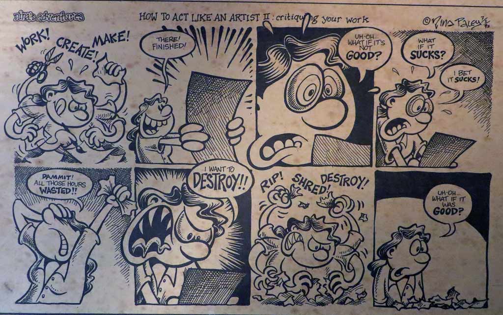
I can still see my Beginning Painting instructor’s bushy 70s walrus mustache motating as he critiqued – no, outright criticized – my certainly awful attempt at the current assignment: paint a self-portrait as a famous person. On a 3’x4′ canvas I had modeled a full-bodied gesture of Greek-robed, barefooted Isadora Duncan in mid-bound and was having trouble putting my features onto it at all convincingly. I particularly remember the mustache’s emphatic contract/expand curl as he sneered the word “dumpy” in slow motion. “IS-a-dora DUN-can WAS NOT DUM-PEE! ” he intoned as he was actually looking down his nose at me.
Thing is, this guy worked hard in his critiques at tearing apart the whole line-up of our work. I was not singled out here, but by the time he got to me I was seething. At the sight of that slo-mo sneering ‘stache, I blinked. Out of hot shame and powerlessness, I sputtered back with all I had: my born fightin’ Ulster-Scot sense of justice and fairplay. “We already know our work is bad!!!!!” I yelped, “Why don’t you help us see what’s good about it???? Or at least suggest what we could try to make it better????”
I wish I could tell you what happened afterwards, or even the rest of the semester, but soon after that episode I had an emergency appendectomy and took an Incomplete. Within the year allowed to remedy the INC, I returned to his office with several other paintings I had done without the torment of his criticism. I got a B. Not sure it’s a direct consequence, but I have never taken another painting class.
Yogi Berra said, “You’ve got to be very careful if you don’t know where you’re going, because you might not get there.” That sums up my early years in ceramics, both with forming the clay and most definitely with the glazing and decorating of it. Even so, when I look back, there are hints of a direction, or at least a pretty persistent search for one.
If I thought forming clay to match my ideas was difficult...(and I did; see last post.)
If I struggled with finding the best timing to shape, attach, carve or walk away from the clay….(Yes.)
If I never was quite certain if I was making it or if it was making me….(both, really.)
Well…. let me just aver, utterly, soberly and whole-heartedly: Those consternations were NOTHING, nothing at all, compared to learning how to choose and apply fireable finishes.
To my credit, I tried every method that came my way: high-fire, mid-fire, low-fire glazes. Stains, oxides, washes. Powders, pencils, chalks. Raku, pit, barrel and saggar firings. Resists, erosions, bas relief, sprigging. Colored pencils, acrylics, inks, gold leaf. Decals, china paints, lusters. Punk, Zen, Classic, Primitif.
It might be a touch purist and it certainly is a point of pride, but I believe in the completely fired surface. I’m not beyond adding “cold finishes,” but my search has always been to go as far as I’m able with the clay, the ceramic decorating materials and the heatwork of the kiln.
What follows are a selected group of forays into my early surface decorations. I purposely left out the traditional Cone 10 Reduction work because for me it has turned out to be either a default placeholder or a jumping off point for what I really found interesting: Color and the dryer surface.
Using Three Glazes to Make Plaid, 2002
Here I am getting fancy with lowfire glaze application. If you’ve done anything similar you know glazes chemically react to each other in surprising ways while melting and moving with gravity. This Three Glazes Making a Plaid was probably my most interesting semi-intentional effect. It was basically an over/under triad test tile without me knowing what that was. Yes, the blue and yellow made a sort of green, but I did not expect so much movement on the vertical surface and was lukewarm about the result. I moved on to the less-flowing colorful underglazes which were definitely more WYSIWYG.
Bright Circles with Hatchmarks 2003
This was more like it! Created during a short two-week Surface Decorating workshop, here’s a simple flattened pinch pot shape which continues the idea of primary color layerings in the previous glazed piece. It benefits from not too much movement in the underglazes AND some bold crosshatched scratches through the wet application. It’s an example of holding gold in your hands and not knowing how to follow it up with any meaningful variations. I may just have to replicate this effect now.
It’s common for academic programs to emphasize Cone 10 reduction glazes and firings and downplay working outside that format. My detailed, colorful and Cone 6 oxidation fascinations met with little support in regular classroom assignments and I did not return to them for two more years.
Copying Desert Rose (on left) 2003
But one fun thing before we continue: Once I learned that Duncan Concepts and Mayco Stroke ‘n’ Coat underglazes applied and mixed similarly to paints, I hacked my Franciscan Desert Rose china pattern. I know exactly the colors to use should I ever want to be a commercial china pattern “paintress.” May have to revisit this one as well.
Sgraffito and Painted Vase 2004
In an attempt to replicate the linearity of drawing AND the dry-brushed watercolor/colored pencil subtleties I had managed in my previous 2D work, I tried a sgraffito technique which resembled old hand-tinted woodcuts. The piece was covered with black engobe at leatherhard, then carved when it set up. After bisque firing, thin washes of non-shiny underglazes were applied. They seemed to film up the black, which I needed to restate. It got complicated, but there were vast possibilities here. It let me draw, added lovely directional textures and also let me add color without resorting to too much muddying flow or unsubtle brightness.
Isadora Series 2005
It’s good to have skills, but what to do with them? Above are four pieces related to the dancer Isadora Duncan, three of the four using the dry finish colorized sgraffito technique. These works culminate a certain era in my Backlist Story, so we’ll wind it up with them.
It was gratifying to work from the concept end of clay creating, choosing the forming and finishing techniques I’d enjoyed the most in the service of a Big Idea. They sprang from four separate semester assignments which I knit together around my theme. They were to make 1. A Hood Ornament 2. A Surprise Box – something which looked different from what it contained, 3. A Portrait of a Loved one, whether representational or symbolic and 4. A Place Setting for the Feast of Dreams, which could be a metaphor.
Here are some closer looks
Isadora Duncan Hood Ornament 2005
Based on a photo of the dancer, and modeled fairly solidly and then hollowed out and glazed with a bronze metallic glaze (who said I didn’t like shiny?), this would be a completely classical over-the-top hood ornament for my Art Car!
Surprise Over-sized Caviar Tin with Quotation Clouds 2005
Here’s a humongous (over 12″ in diameter) caviar tin replica – Isadora loved caviar! – full of sgraffito’d and painted quotations (and she was supremely quotable.)
Greek Vase Style Champagne Bottle 2005
A champagne bottle “portrait” – Isadora loved champagne! – based on drawings of the dancer, done in Greek vase red figure style. Finding just the right classic Greek vase red was a challenge! But I had a Greek fellow student who helped me with the inscriptions.
Isadora’s Scarf Mosaic 2005
A metaphoric Feast of Dreams place-setting in sgraffito mosaic, mounted and framed. It is based on a description of the six foot long -with 18″ fringe – silk batik scarf that Isadora was wearing when it wrapped around the axle of the car she was riding in and strangled her. Dramatic to the end. Let the scarf be the picnic cloth for the hereafter.
And creatively speaking, the Isadora series opened up my personal voice, in not only forming and decorating methods, but in subject matter. Ever after, the work has demanded my personal involvement in the meaning of it as well as the making. At least I know THAT much about where I’m going!
~Liz Crain, who once had an art advisor critique her work by saying, “So you can paint! What now? What will you say with it?” It was so amusingly and lovingly said, it has stuck with her as a purposeful guide.
This website uses cookies to enhance user experience and to analyze traffic on our website. If you continue to use this site we will assume that you are happy with it.