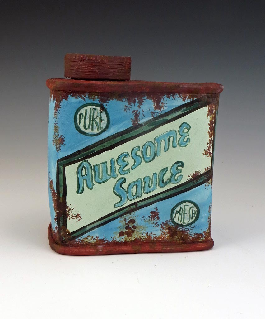
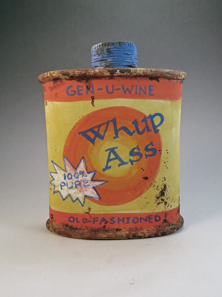
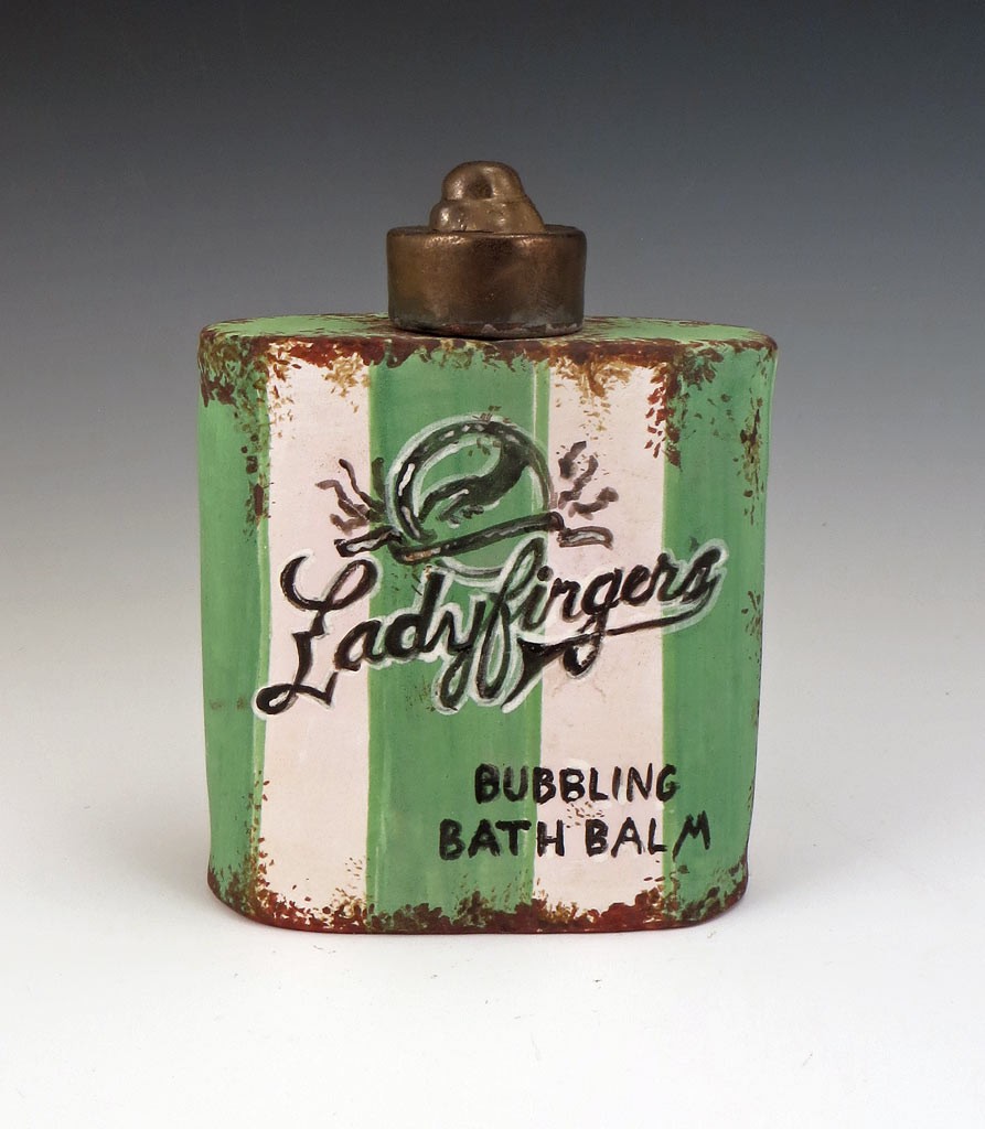
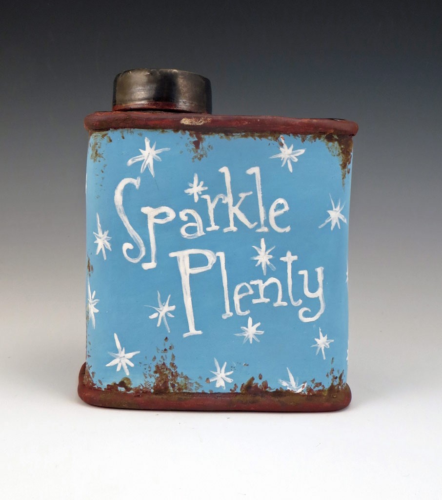
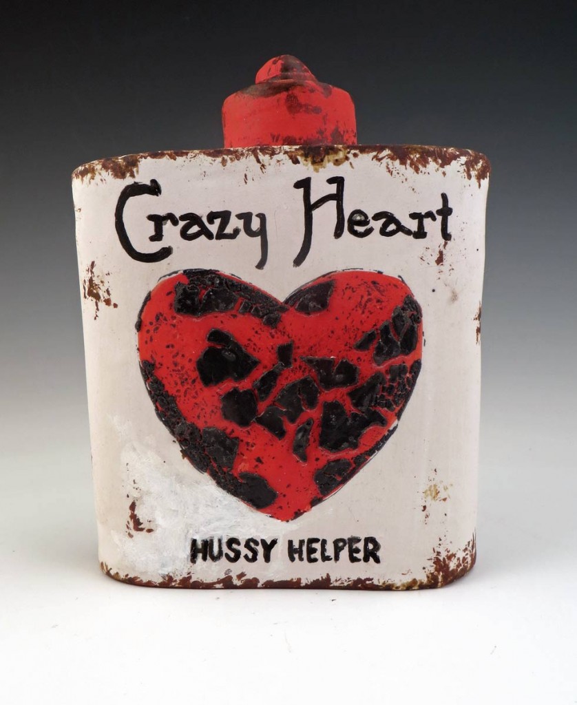
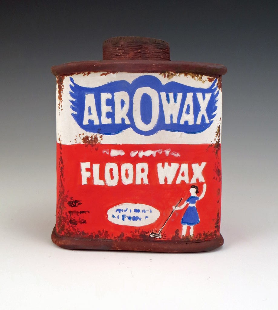
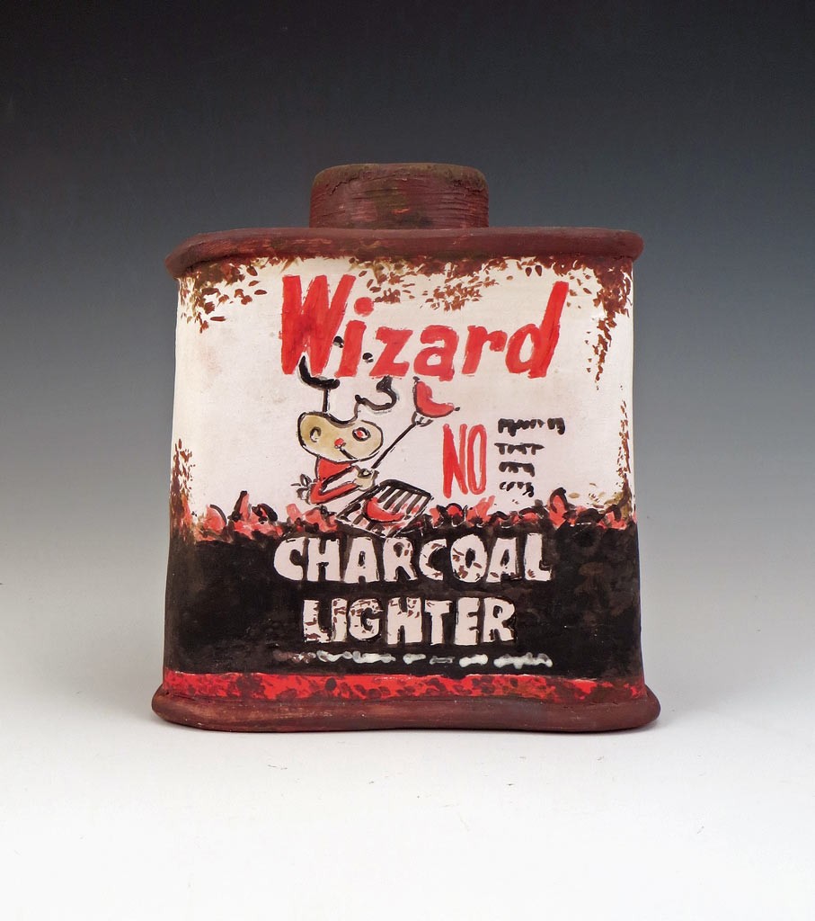
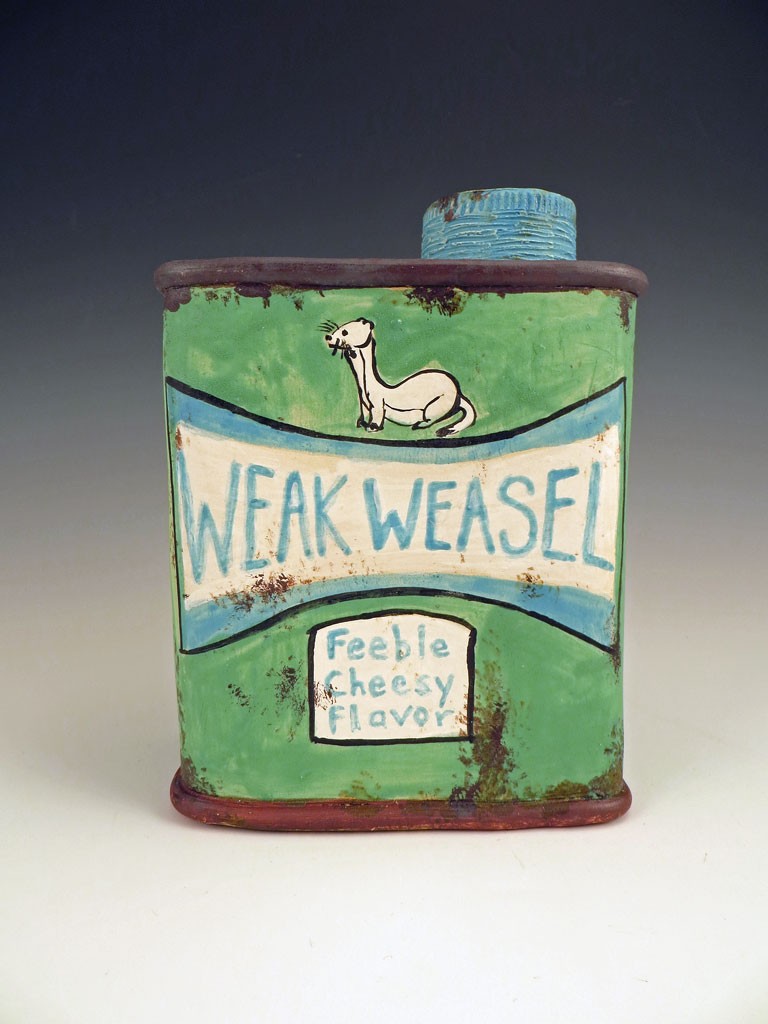
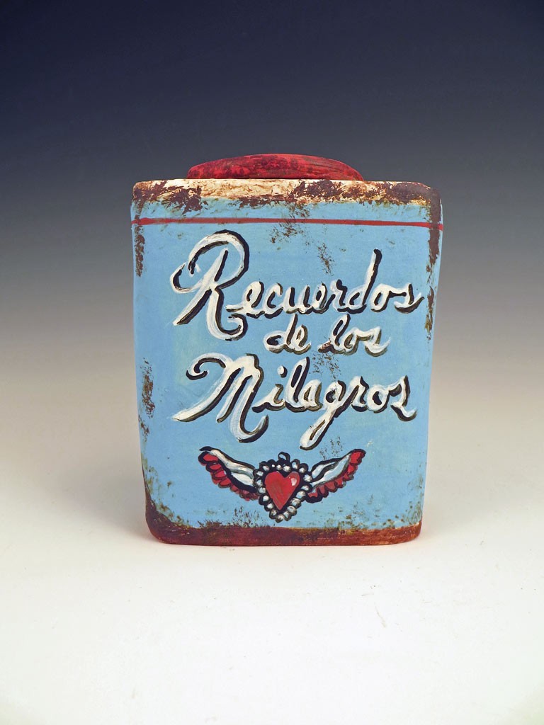
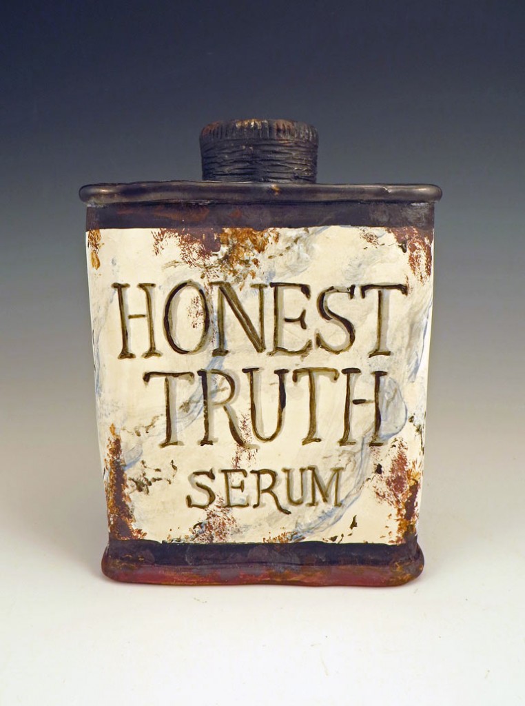
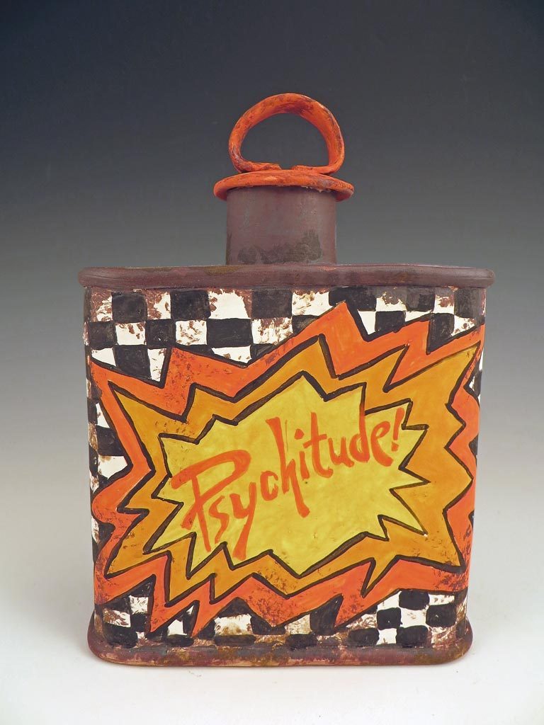
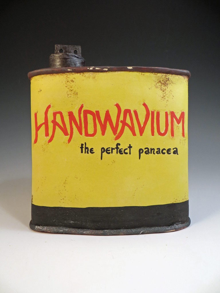
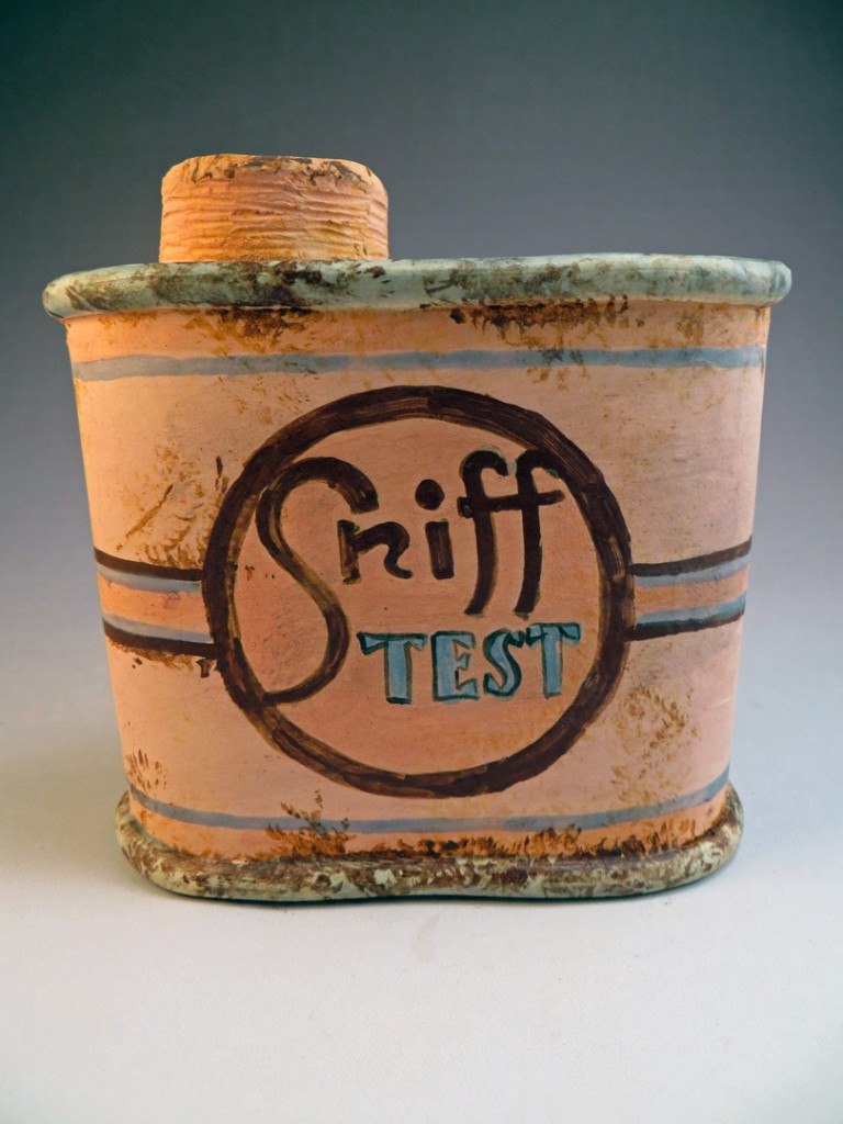
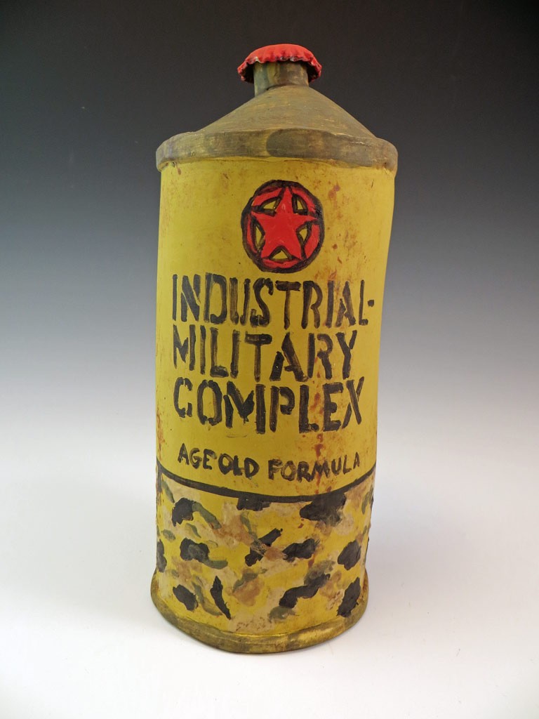
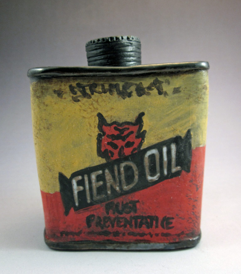
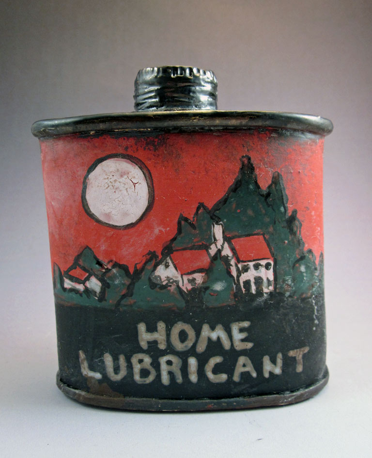
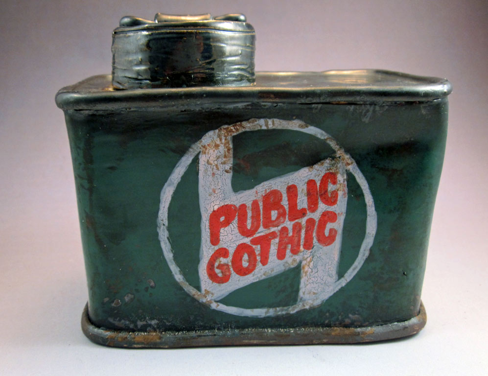
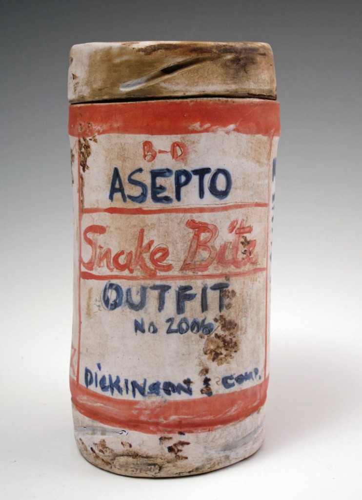
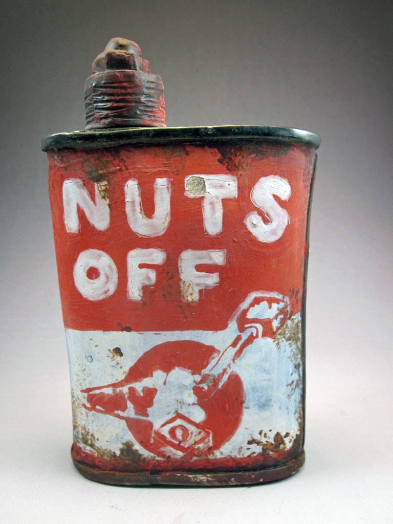
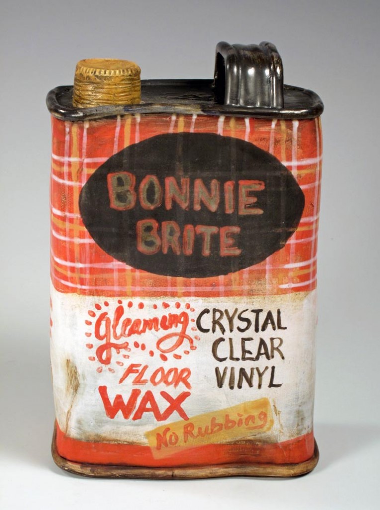
What’s fun about these container shapes – whether or not their purported contents are real or imaginary – is the way in which packaging creates both info and appeal. The fronts carry most of the load, but details from all the other surfaces can support it. Those fonts, tag lines and bursts really come into play. Add in some random dents, some faux rust, a functional lid and you’ve got a fool-the-eye Gen-U-Wine work of art.