Thursday’s Tile: A Grotesque of the Sensorial

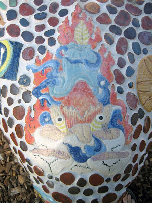
Here’s an odd little blue guy–seems more like a guy than a gal, right, even though he is Ken-doll smooth? You can locate him on the fourth corner/knee area of the Five Senses Bench, between Hearing and Smell.

Some of you may recognize the odd little blue guy as a sensorimotor homunculus, a representation of how our cerebral cortex perceives information from our physical body, only partially based on the number of nerve endings and capillaries that are present.

The science around this is fascinating because it delves into the nature of consciousness. If you take a thoughtful moment to gaze at even this simple of a representation, it is a tiny leap to realize just how literally Hand-to-Mouth our existence is! Are we really very much different from lobsters?

There are other alchemical, philosophical and even psychological versions of homunculi (the plural!) and they seem to hold the idea of the person within the person, the man in a lab beaker, the boy in the bubble. What wholeness lies within? I’ll let you explore those threads on your own. For now, let’s just keep it to this particular physical representation and its place on a Five Senses Bench public art project.

We haven’t really talked about the public art part of this project, but even in the beginning the idea was to place this bench somewhere on Cabrillo’s campus, and it was understood that it would be visually acceptable to nearly all viewers. You know: no gratuitous violence, gang symbols, pornography. That was playfully easy.

When the bench was still under construction, I had a teacher from a nearby school, who was scouting a field trip for her Kindergarteners, ask me to cover up a few tiles: the knife, the small pile of poo, the mermaid’s boobies, etc.  I obliged her by taping over them for their visit, but I felt compromised and lousy about it and vowed never to do that again. The bench was not being installed on a kiddie playground, but a college campus!  Let’s keep it acceptable to adults in a semi-public place and never, never, never censor it again!

If you want the most up-to-date, scientifically accurate representation of a sensational homunculus, though, it must include the genitals, thusly:

Oh, my! That changes things! Attention teachers at nearby elementary schools: be glad we did not have this as a model for the odd little blue guy! But really, that bench image, along with all the others, is meant for entertainment and pleasant discussion, not a neurological lesson, and it does that just fine without scientific replication, as do most other depictions of a sensorimotor homunculus out there.

Curiously, though, the homunculus is always male. Would a female be differently proportioned or would the differences just be in the genitals? What would a dog’s version look like? An eagle’s? A lobster’s? Someday we might know this.

As it turns out, the odd little blue guy is a fantastic conversation starter about our physical abilities to perceive the world around us, including what we can touch and see, smell, hear and taste sitting on a mosaic bench while we eat our lunch in the sun and light seabreeze.

Share this:

Bony Proportions and The Two Hour Challenge

This past year I have sought out the teachers who can tell me what I want to learn in ceramics, a practice I definitely want to continue! Sometimes they are wise colleagues, but more often it has been certain college instructors. Last Summer it was Tiffany Schmierer at Skyline College in San Bruno, CA. This Fall it has been Cynthia Siegel at Cabrillo College in Aptos, my regular haunt.

Cynthia is an exacting master. When she communicates, she expects attentiveness, responsiveness, engagement and active execution. I revel in that! She means what she says and has scads of expertise to share. So, without writing a chapter and a half about this semester, let me show you, mostly in photos, what transpired.

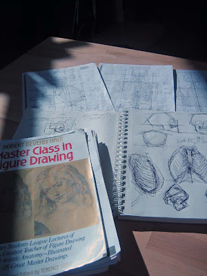
The photo up top contains the digest version of weeks and weeks of exploring reference material for the skeleton. Rather than just making figure sculpture(s) all semester, Cynthia recommended that I delve into the human bony proportion canon of Robert Beverly Hale, and then set about carving a skull, ribcage and pelvis set on an armature in order to have that learning ‘go deep.’

Folks, I was daunted! What the hell kind of shape is a pelvis? I must have made three of them, each stinking on ice. How to translate 2D drawings into proportionate blocks of clay and then ‘find’ the pelvis or ribcage or skull in each one? How to make a temporary armature? How to keep the soft clay from stretching out of its boundaries? How to breathe any kind of life into such an attempt, even if I never plan to fire or keep it? (Hint: find those S curves!!!!)

The photos here show how far I got…..hours of searching for those shapes, consulting with Cynthia and adjusting. It was grand. I am not done, but it is just possible I can’t be. Here’s the work in infinite progress. Skull looks a little too round in the photo, too much like Jack Skellington. (Not done!)

What can never show is what went deep inside my mind and sense of touch and form in space from this exercise. It is forevermore beyond cognitive because it lives in my muscle memory too.

That could be the end of our story. It certainly was the end of the semester as next week is Finals. Bony Proportions Skeleton: Check! But, Noooooooooo, Cynthia wanted more from me. She issued this Throwdown: Take two hours and make a figure, any position. Don’t worry about finishing, just bring it Monday to the Final.

What a genius assignment! It allowed me to translate my newfound skeleton framework knowledge into a narrative and to use that knowledge while it was still fresh.

I chose an old newspaper clipping of a local high school runner, Maggie Vessey. She had just lost a race badly and apparently had thrown herself down in the Agony of Defeat. I had kept it because it was so evocative. Here was my Two Hour Throwdown subject! (Pun intended.)

The challenge was to find the skull, ribcage and pelvis positions underneath the clothing and the muscles, to add the appendages and breathe life and gesture into it. At least that is what I wanted out of my two hours. Not getting lost in the details or perfectionism were other factors.

More challenges came from making a 3D piece from a 2D shot. Just what might her left side be doing? I crouched into this position and my own body gave me suggestions. Staying on task, lively and attentive is sometimes a problem for me, so I was proud when I did not stray from my task for more than 4 minutes the whole time.

Here are shots of the result:

Wow, is what I have to say…not because the piece is so stellar, but because it is evidence of a whole new way of understanding the figure. I am so glad I got to experience my skeleton knowledge while it was vivid. One less vague area with light shed on it. Thanks, Cynthia!
P.S. Since 2000, when this photo of Maggie Vessey was taken, she has gone on to be 2009 World Champion in the 800M. Go Maggie!

Share this:

Thursday’s Tile: Wrathful Offering to the Five Senses

Naughty or nice? Buddhists might contend E, All of the Above, conflating dilemma horns into the whole animal. The Five Senses Bench, too, includes some tiles that are beauteous and uplifting, some funny, some rather crude, and some, like this Tibetan Wrathful Offering to the Five Senses tile, that function as wake-up calls to everything. That is, if you can read the stylized symbology.

If you didn’t click over to the Wrathful Offering to the Five Senses link, that’s OK. And if you did, it doesn’t really tell you what you need to know, so I will describe what you are looking at: Several upside down human skulls at the bottom are holding organs. Above them are a tongue, two loose eyes on stalks with ears behind, and between them an upside down heart. On top are more waving clouds and other common Tibetan/Nepalese imagery. Flames edge it all. (And I am sure someone more knowledgeable could make more points and connections for you.)

The whole is meant to appease wrathful deities, and maybe scare the bejeebers out of us humans with its upsetting dismemberment. But it goes beyond that as a Five Senses Bench tile: it is a very real balance to maudlin treacle.

Nothing I say here is meant as judgment: maudlin treacle needs love just like wrathful offerings. In the grand scheme of things, maybe this bench will contain a Whole beyond anything we currently may think it is. Art is open to waves of interpretation over the centuries, even millennia, which this bench thing can certainly last for. Case in point:

Yesterday I watched a passle of pre-schoolers on a field trip swarm the bench. They were all eye-high to seat level. Eye-high, too, to this particular tile, which rounds the knee area between Taste and Hearing. Did they see it?

Or did they spend time with what was in front of their faces that they could recognize, thereby forging new neuron pathways? Did their teachers point out anything? The knife? The Butt Stop tile? The soft-serve poo tile that PMcN gleefully created? Or did they just experience colorful mosaic enormity and then run down the slope into the nearby wildish Glen?

Well, whatever…they looked with 3-year-old wonder that will become 30-year-old wonder in a twinkling. If they came back in 27 years, I know for a fact they will think the bench is much smaller than they remembered, but it just might contain more narrative that they can hook their lives to. It is a magical object either way.

Anne Lamott said/wrote one of the finest perspective giving lines ever: “A hundred years from now? All new people.” Must remember that. Naughty or nice? Both!

Share this:

Thursday’s Tile: Not Just Plain Vanilla

As a kid did you ever take a nip from the bottle of Vanilla Extract, quickly finding out that its alcoholic bitterness in no way resonates with its unbelievably enticing aroma? Well, I did, anyhow. Decades later I got a similar vanilla shock: vanilla beans actually come from an orchid??? Wild. Wacky. I did not know that.

When SR suggested that she fashion a Vanilla Orchid for the Taste area “knee” of the Five Senses Bench,  I thought she and her capable hands were just going to make something creamy and wonderful to solve the very real problems associated with making custom curve-specific tiles. My previous post about the Octopus tile on the Touch knee area explores these challenges and one solution in detail.

She was incommunicado for several months on this, working mostly in her own studio.  When I had nearly given up on receiving anything for the area, she happily delivered this whole lovely assembly of orchid flower, leaves and the most wonderful vanilla beans to go with. If I remember right, it was in four or five specifically overlapping pieces: another way to solve the fitting-a-curve problem.

The biggest form had curved just a tad too much in the firing, but had not cracked. And it was not too curved as to be un-attachable. We solved the installation problem by adding a fatter layer of thinset underneath each of the layers to make up the difference and protect the various points of leaves and petals. The vanilla beans were separate, so that made attaching their delicacy doable too. The whole assembly did not quite go where intended, but who’s the wiser? (Shhhh.)

The TakeAway here is about surprise endings: getting something surprisingly different than you expected: maybe shocking, maybe relevatory, maybe just exquisite and audacious and bar-raising. Thanks, SR.

Share this:

Ceramic Yoga

Sometimes it’s just necessary to see how far you can push it. I call it finding the Edge of My Stretch, after some yoga instructor’s encouragement to go further,  but just the right amount of further and no more. Making the Hot P Oil Can above involved the fun challenge of asking wet clay to behave in yoga-like ways, both gesturally AND structurally, and to look beautiful while doing it.

Clay has great compressive strength. Downward pressure is generally not a problem, especially if it is allowed to stiffen slightly before piling on another layer.  But stretching it out in unsupported gravity-defying lengths is just asking it to sag and crack and misbehave: clay does not have very good tensile strength!

So, let the stretchy fun begin! One kind of vessel form that continues to interest me is utilitarian and industrial, but old and beat up. Watering cans, buckets, spice tins, old wastebaskets and all kinds of commercial – many from the petroleum industry – containers. My fondness is for early 20th century pre-plastic forms, some made of glass, but most made of metal, a material that has exactly the opposite compressive and tensile strength properties of clay.

It becomes an interesting proposition, then, to fashion a semi-eye-fooling version of one of these containers, soldering, rivets and all, AND to push it even farther than the original to the ceramic asana which makes it art.
Here’s one source photo (but not the main one I used, which I cannot locate now) for the Hot P Oil Can:

Some of the other photos reveal much bigger handles and longer spouts, and much less readable labels. It was easy enough to form the ovoid body with its splash guard on top. It was even pretty easy to add the particular horizontal welts along the bottom and top edges and  to make the crimped smaller foot.

The challenges were in making that outrageously loopy handle and that long-necked spout with those particular angles, all while the clay was still wet enough to curve, but dry enough to stay put. A few times I needed three hands and I definitely needed to delicately prop things up until firm.

Aesthetics-wise, I usually intend to make objects that look “real enough.” By that I mean that they highly recall the originals but are still clearly NOT them. If you want uber-realism, buy the actual thing or take a photo! Otherwise, let’s see evidence of the hand at work. Same goes for the decoration.

I applied pale blue underglaze “primer” color to the leatherhard clay, bisque-fired it and then added many layers of mixed underglazes for the old label. When they had all dried, I lightly sanded and scratched those layers to suggest the wear and tear on old painted-label cans. I ‘greeked’ in the body lettering, something I really enjoy doing.

The metal parts have a glaze called Ming Gunmetal, a useful low-fire glaze which is a satiny silver breaking to green, as you can see in this close-up.

Sometimes I position my body in the ‘pose’ of my pieces. It’s another way of understanding them and is surprisingly helpful. I guess the yoga reference goes beyond creative stretching and problem solving, then, all the way to the actual thing. This vessel suggests balancing with big outward movement: Extended Hand to Big Toe Pose, which I find easier to do in clay!

Share this:

Thursday’s Tile: Taste on Hooves

It’s Thanksgiving Day with lots of family and food to enjoy, so here’s a short and sweet post about one of the most unusual tiles on the Five Senses Bench at Cabrillo College. Its source is an old drawing of a Native American horseback rider just about to shoot a wide-eyed and galloping buffalo with a fully drawn bow and arrow.

AB was a young man of tentative speech and Deep Thoughts and he went ‘way outside the box for a tile which is down low on the Taste area.

I have more questions about this tile than answers, but I am still glad it is there, evoking a separate reality in a sea of candy corn, pizza and gummi fish.

Did he mean to suggest a taste for blood?
Was he referencing food for pure survival instead of entertainment?
Did he want us to think of a more direct way to hunt and gather our sustenance?
Is he offering any chastisement of modern food gathering, especially of our meat?
Is this a nostalgic historical scenario?
Is there any political/cultural commentary here?
Did he just want a narrative verb-like tile instead of a static noun-like one?

I don’t know! I never got an opportunity to ask him because after he made the tile he dropped out – but not before he sweetly asked me to promise to finish the tile’s glazing and attaching.

Even though he still comes and goes on campus, I would never be so bold as to put him on the spot with all my unanswered questions. I would have to be very oblique and casual, and since so many years have gone by, he may not even remember what he intended.

Do you have other questions? Do you have some answers? I personally love the mysteriousness here and the fact that I don’t get it is just fine. Back to family and feast!

Share this:

Thursday’s Tile: Help, There’s an Octopus on My Knee!

The octopus is a highly intelligent eight-armed bag, capable of taking just about any shape it needs to. What a great choice it was for the rounded corner of the Five Senses Bench in the Touch area. I call these four places the “knees” of the bench and if you go to the FSB link you will be able to see this octo-tile on the closest corner in the whole-bench shot. Oh, and you can read the backstory too, if this is your first time encounter with it.

The woman who made this tile, NB, was quite a meticulous artist who was also studying for her single subject teaching credential in Art. (Which she later accomplished.) Of the time she spent at Cabrillo Ceramics, she made wonderful pieces, very realistic in both form and decoration. Lots of animals: cougars and giraffes, dogs and deer, all expertly executed.

She originally modeled this octo-tile in one curving piece, but clay has an interesting memory for how it has been handled, and when it necessarily shrinks – first in the initial drying and then later in the heat of the kiln – it can very easily curve more or crack apart, or both. Her damp one-piece tile fit so artfully in place, and, even allowing for shrinkage, it was nearly a certain-sure thing that it would NOT fit after a 2000+ degree firing. Too big, too oddly shaped, too site-specific.

What to do? The obvious: cut it apart thoughtfully and intentionally into true mosaic pieces which would give it the ease to round that knee curve. Let them warp and crack! We would still be able to make adjustments in how we attached the pieces in order to make it all fit in the area mapped out for it.

NB balked some because her vision was to have that tile be mind-blowingly whole. How much was she willing to risk the outcome in order to show off that skill? Did she have the time or resolve to re-make it if she failed? Or did she want the greater assurance of a successfully finished piece the first go?

There was some hand-wringing involved, such was her personal creative process, but you can see her choice, fitting like an orange suction cup around that knee, right next to the TOUCH label. This octopus is loud and proud, not hiding in the least bit, still showing off.

Share this: