Ceramic Yoga

Sometimes it’s just necessary to see how far you can push it. I call it finding the Edge of My Stretch, after some yoga instructor’s encouragement to go further,  but just the right amount of further and no more. Making the Hot P Oil Can above involved the fun challenge of asking wet clay to behave in yoga-like ways, both gesturally AND structurally, and to look beautiful while doing it.

Clay has great compressive strength. Downward pressure is generally not a problem, especially if it is allowed to stiffen slightly before piling on another layer.  But stretching it out in unsupported gravity-defying lengths is just asking it to sag and crack and misbehave: clay does not have very good tensile strength!

So, let the stretchy fun begin! One kind of vessel form that continues to interest me is utilitarian and industrial, but old and beat up. Watering cans, buckets, spice tins, old wastebaskets and all kinds of commercial – many from the petroleum industry – containers. My fondness is for early 20th century pre-plastic forms, some made of glass, but most made of metal, a material that has exactly the opposite compressive and tensile strength properties of clay.

It becomes an interesting proposition, then, to fashion a semi-eye-fooling version of one of these containers, soldering, rivets and all, AND to push it even farther than the original to the ceramic asana which makes it art.
Here’s one source photo (but not the main one I used, which I cannot locate now) for the Hot P Oil Can:

Some of the other photos reveal much bigger handles and longer spouts, and much less readable labels. It was easy enough to form the ovoid body with its splash guard on top. It was even pretty easy to add the particular horizontal welts along the bottom and top edges and  to make the crimped smaller foot.

The challenges were in making that outrageously loopy handle and that long-necked spout with those particular angles, all while the clay was still wet enough to curve, but dry enough to stay put. A few times I needed three hands and I definitely needed to delicately prop things up until firm.

Aesthetics-wise, I usually intend to make objects that look “real enough.” By that I mean that they highly recall the originals but are still clearly NOT them. If you want uber-realism, buy the actual thing or take a photo! Otherwise, let’s see evidence of the hand at work. Same goes for the decoration.

I applied pale blue underglaze “primer” color to the leatherhard clay, bisque-fired it and then added many layers of mixed underglazes for the old label. When they had all dried, I lightly sanded and scratched those layers to suggest the wear and tear on old painted-label cans. I ‘greeked’ in the body lettering, something I really enjoy doing.

The metal parts have a glaze called Ming Gunmetal, a useful low-fire glaze which is a satiny silver breaking to green, as you can see in this close-up.

Sometimes I position my body in the ‘pose’ of my pieces. It’s another way of understanding them and is surprisingly helpful. I guess the yoga reference goes beyond creative stretching and problem solving, then, all the way to the actual thing. This vessel suggests balancing with big outward movement: Extended Hand to Big Toe Pose, which I find easier to do in clay!

Share this:

Thursday’s Tile: Taste on Hooves

It’s Thanksgiving Day with lots of family and food to enjoy, so here’s a short and sweet post about one of the most unusual tiles on the Five Senses Bench at Cabrillo College. Its source is an old drawing of a Native American horseback rider just about to shoot a wide-eyed and galloping buffalo with a fully drawn bow and arrow.

AB was a young man of tentative speech and Deep Thoughts and he went ‘way outside the box for a tile which is down low on the Taste area.

I have more questions about this tile than answers, but I am still glad it is there, evoking a separate reality in a sea of candy corn, pizza and gummi fish.

Did he mean to suggest a taste for blood?
Was he referencing food for pure survival instead of entertainment?
Did he want us to think of a more direct way to hunt and gather our sustenance?
Is he offering any chastisement of modern food gathering, especially of our meat?
Is this a nostalgic historical scenario?
Is there any political/cultural commentary here?
Did he just want a narrative verb-like tile instead of a static noun-like one?

I don’t know! I never got an opportunity to ask him because after he made the tile he dropped out – but not before he sweetly asked me to promise to finish the tile’s glazing and attaching.

Even though he still comes and goes on campus, I would never be so bold as to put him on the spot with all my unanswered questions. I would have to be very oblique and casual, and since so many years have gone by, he may not even remember what he intended.

Do you have other questions? Do you have some answers? I personally love the mysteriousness here and the fact that I don’t get it is just fine. Back to family and feast!

Share this:

Phrygian Phreedom

Here’s another work from my Tiffany Schmierer Skyline College 2009 Summer Session: Phrygian (the cap’s style) Phreedom (because it is based on the face of Statue of Freedom on top of the US Capitol Building.)

Anyhoo….I have a thing for these sorts of classical faces, both the originals from Ancient Greece and Rome and the Neo-classical interpretations down through the ages.  I have worked with the fearsome face of the Statue of Liberty, and while it is inspiring, it has a certain stern quality. Take a look at some close ups. There’s a straight-ahead no nonsense eagle-like stare to this statue.

Contrast this with the sweet face of the Statue of Freedom! Still inspiring, but perhaps more egalitarian than eagle-like. The more I looked at this face, the more I wanted to make a larger than life-sized head based on it. So, using the techniques I learned a few summers ago from Stan Welsh, I built the basic Big Head shape.  I so appreciated conferring with Tiffany over the technical and aesthetic fine points as sometimes it comes down to millimeters and the fine dance between darks and lights….it really does. We proved it.

What a nice face, but what to do about all that fancy headgear on the original statue? Yes, I suppose it could be made of clay, but it would not only be a dicey proposition to execute and forever vulnerable to breakage, it was also a complete aside to my inspiration: that face.

If one is making a 3D sculpture and is not working from a 3D model, live or otherwise, it is useful to have lots of resource photos, from as many angles as possible. I love the internet for that function alone. In my Statue of Freedom visual travels, I read this whole wiki article of its history, and simultaneously answered my question about what to do about the headdress: The Phrygian cap, aka the Freedom Cap! It was the sculptor’s original choice….and it would be mine because I loved it and it was a tiny way of thumbing my nose at Jefferson Davis’ wrong-headed policies. I would give her the headdress she was supposed to have.

Yes, this hat has appeared in many guises throughout history, and yes, it is a Smurf hat shape too. So???? I love all of it, the sacred and the profane. And, did I say I love this face? I imagine making other versions of it. In the meantime, some of you may recognize it from my Facebook and Twitter avatars.  As I said, I have a thing for this kind of face, so ultimately it is a reflection of me and I am comfortable with that. Phreedom, indeed.

Share this:

Magic Backyard Incinerator Maquette

One of the most vital requirements in art-making, in my humble opinion, is bell-ringing authenticity. To that end, one of my favorite quotations is here on my blog’s sidebar from J. F. Stephens, “Originality does not consist is saying what no one has ever said before, but in saying exactly what you yourself think.”

For me, in both 2D and 3D art, (and in writing about them) it has been a long haul to connect my personal impulses and my technical capabilities so that I get a result which comes dang near to what moved me to attempt it.

As if you did not know, we humans often tend to have ‘way more complicated ideas than we can bring forth. When I sewed all my own clothes in high school, my biggest mistake was in making conceptual errors which lead to technical difficulties: not matching the fabric to the pattern or vice versa. I would pick a coarse kettlecloth and ask it to drape in soft mini-folds….or I would attempt to tailor double-sewn pockets with button-down flaps out of whisper-thin silk. In the right hands, those choices could work, but not for me at my skill level. I could think it up, but not do it.

Pictured here is one ceramic sculpture that comes together better than my home-sewing. It’s about 18″ tall and its working title is Magic Backyard Incinerator Maquette, because someday I intend to make a life-sized one.

It’s one of the works I created in my Super Schmierer Skyline College 2009 Summer Session. I think I have mentioned that I put 2500 miles on my car in six weeks in order to study with someone I absolutely knew could help me connect Authentic Impulse with Technical Execution: Tiffany Schmierer.

What I enjoy about this piece, besides its wonderfully figurative presence, is the journey making it took me on. When I was quite young we lived in LA’s San Fernando Valley. In the backyard was this imposing Cycladic figure with fire in its belly and smoke coming out its noggin: our incinerator. Every house had one, because, amazingly, there was no garbage collection in all of Los Angeles County. That is, until folks noticed the rotten air quality and backyard incinerators were banned by Proposition A in 1957. Gone was my fire-breathing buddy. (Where? To the dump? Hrmmm.)

We moved to Northern California soon after and I never thought about it for years and years and years, until I began visiting the objects of my childhood in my art. I needed photos to make this maquette accurate. I got them here and here and here.

I also got news write-ups which explained what I had not known and even my mom could not recall: exactly what happened to make the incinerators disappear. And! I found this exquisite poem, “In the Days of Backyard Incineration,” by John Nimmo. It so moved me that I transferred the last part of it onto the back of the maquette, as you can see here, which really turns this piece into a sculpture by lifting it even beyond my intentions (but, for once, not my capabilities) to a supremely thoughtful place.

When I make the big one, I will be able to inscribe the entire poem which, (poetically) observes that waste is waste, however satisfactorily we think we are getting rid of it. No small point, considering the size of our planet and its population.

All that from authentic curiosity and technical exactitude. More magic. Hooray!

Share this:

Local Talkers: Third Quarter Gathering

Quick now, how many weeks in a quarter of a year? How many playing cards in a suit? How many donuts in a Baker’s Dozen? Yep, thirteen and thirteen and thirteen!

And, now, how many columns in the photo above? Oooooh, twelve! Looks like, after hitting the half year mark last June in my year-long one-a-week small face jug project based on the question man-type column called “Local Talk” in the Santa Cruz entertainment rag the Good Times, I just might have gotten one done in the Third Quarter.

But, oh, what a good one! And oh, what a great lesson in the creative process! Am I bothered and beating up on myself over not working The Plan? Absolutely not. Did I earlier? Maybe, although I was so busy I don’t recall.

Basically this project is going like this:

Last January, Week One, I tremblingly cut out the column on that first crystalline Thursday, went to my studio and made a small jug. I sweetly imagined myself doing this each Thursday the entire year.

Might have done that for the first five weeks.

From February to April I wound up making jugs every 2-3 weeks, a more economical use of time! I bisque-fired the first thirteen from Quarter One and wrote a few blog postings about it.

The blog photos and the writing gave an accountability to the project like I had never experienced and I created the jugs for the Second Quarter with anticipation. It was great fun to introduce them.

So then here came the busy summer, the busier fall. I have made lots of ceramic pieces, just not my Local Talkers.

Of course, I still collect the Thursday paper and date and number each column. If I start to fuss over the backlog, I breathe and take a much longer view. How do you take care of your dreams? Gently. Lovingly. Determinedly. With humor!

Look at all that potential up there! I scan those faces, absorbing them and conceptualizing. This apparent pause is rather normal and not a cause for any flustering doubt or flapping guilt. It is a time of Gathering: ideas, columns, steam, right intention and focus. When I get back to the making, addressing each week in order, I will make one lovely face jug at a time with all my heart, just as I imagined.

I will still bisque the whole lot of them before I add the colors. I did research and test some of my color ideas over the summer: more Gathering! When I have the whole year, the full deck, the Baker’s Dozen times four, they will begin to become the body of work I intend. In the meantime, I take it bird by bird.

So that’s what’s happened in Quarter Three. That and this:

All my gentle, loving, determined, funny and irreverent wishes for the rest of the year!

Share this:

Come to Our Senses Bench: A Group Art Saga

What you’re seeing in the photo above is the result of a powerful public art odyssey. It’s a free-form handmade mosaic bench that I ended up coordinating the tile work for. I am so thrilled to see it in position to be permanently installed in the new Visual and Performing Arts Complex at Cabrillo College in Aptos, CA, that all the descriptions of its making and meaning want to come tumbling out of me together.

What if I start with the inscription tile: “Come to our 5 Senses Bench, Created by over 375 students and staff of Cabrillo College between 2003 and 2007.”

Yes, you read right: 375+ artists contributed to this major oeuvre! And yes, it took four years to complete. And yes, it took 2+ years to move it to its ultimate site this week. Gather close, kiddies, and I’ll tell you the tale.

Early Years: Inspiration/Collaboration
In the Spring Semester of 2003, Sculpture instructor Jamie Abbott and Ceramics instructor Kathryn McBride cooked up a plan for their students to design, build and make tiles for what was originally a three-piece bench grouping with the theme of The Five Senses. The framework and smooth coating for one main part was what actually got built by the Sculpture students and then passed to Ceramics students.

The semester ended soon after, and this gray baby elephant of a bench still needed lots of continuing effort to design, make, glaze, fire and attach tiles, not to mention to sort, store and edit the tiles in all stages of completion. Many a summer work party that year spent most of its time attempting to define and refine the Five Senses theme and to reconcile specific tile images and shapes with the curves of the bench surface. The project seem to loom larger and become more complicated the more it was worked on.

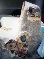
In time, the original bench enthusiasts took different classes, graduated, transferred to other schools, got jobs, moved on. Work on The Bench languished. By 2005 the tarp we had carefully kept over it had gone away and the palette it sat on was showing signs of sagging. The work “parties” had dwindled to me and Kathryn applying a tile or two and wringing our hands over the vastness and confusion of it all. Here’s an early shot in which the bench looks more like the granite expansiveness of Half Dome and the tiles look like lichen growths.

Car Crash Epiphany
This is where the plot takes an unexpected turn, pun intended. One early morning in July, 2005, my 20-year-old son Roger crashed our Honda Civic sideways into a tree on Highway 1 near downtown Santa Cruz. No drugs or alcohol, just a bit too much downhill speed, some faulty brake work done only a day or two before, and a lot of OC donut spinning because of losing traction crossing the railroad tracks. He was mildly scratched; the car was clearly totaled. Gives me the willies to think of it even now because there was a bit of a Sleeping-Beauty-pricks-her-finger-on-a-spindle curse fulfillment surrounding that crash. Sleeping Beauty did not die, because the original spell was amended, she just fell into a deep sleep…and Roger just got a wake up call from the Universe.

And so did I. I was moved to eliminate all extraneous activities from my life. The idle-chatter coffees, the stray civic involvements, the leftover obligations: all gone! I told Kathryn I only wanted to do what had the most heart for me: ceramics and finishing that bench. She said yes! and thereby graciously provided the conduit to the willing hands of her three classes of students for what turned out to be a couple of years.

The Middle Mash-Up Years
Over the next four semesters I introduced the bench project to 13 Beginning Handbuilding Ceramics classes and invited enthusiastic students to brainstorm image ideas and to make tiles for each of the Five Senses. The inventiveness of such a large, changing group of all ages and sensibilities contributed mightily to the wonderful wildness evident in the whole piece. There are stories to go with each one. Some of them I know: that realistic cigarette in the Smell area? The maker, a former smoker, told me he would always know where his last smoke was.

This one, also from the Smell section, is by a repeat ceramic student who prided herself on having a tile in each Sense, all involving fingers. And it was only after her hand image tile was placed in Touch did we all discover it had six fingers!

While the first crowds worked, I set about clarifying the imagery on the bench and found myself reluctantly chipping off and patching up some irrelevant and damaged tiles from the very early time when we were applying every tile we could get our hands on regardless of whether it served the overall themes in any way. Man, I hated creating MORE gray places to fill, but I can send up a silent thank you prayer for that now as it completely aided in the clarification of the project.

Bringing it Into the Station
After all those semesters of massive tile production by so many willing hands, including addressing the dividers between the Senses areas (what I call the River Tiles) and groveling around on our sides tiling the bottom edge in what I think is a rather orderly and upholstery-like border, it finally seemed to be getting covered. There were more tiles than grayness!

In the final semester, a whole new level of tile generation arose. Up until this point, all the tiles made fit somewhere in the correct area, but this was no longer so. What was needed now were tiles of very specific shapes and curvatures. It was also clear that in lots of places the gaps between tiles were too large, so we began to make and sprinkle in repetitive filler tiles: tiny candies for Taste, musical notes for Hearing and so on. At this point we were bringing the wet clay out to the bench and cutting and shaping all the tiles to fit a custom location, including allowing for shrinkage! The last gaps were closed by some special luster-fired tiles and finally I attached what was clearly the last one. It was grouted and sealed the week after Spring ’07 finals.

The Behemoth Stays Behind
The whole time the bench was being created, so was the grand new Visual and Performing Arts Complex. We knew we would wait for The Move, scheduled for sometime in 2008, in order to place it in the new digs somewhere. Well, moves are tough, calling up major doses of the unexpected as they do. We were 30 years in the old location and the new location was not quite done, so you might begin to imagine what came up in transition. Selecting a place for The Bench was ‘way down on the To Do list for a long, long time. Occasionally someone would ask me about it; occasionally I would go back to that part of campus, sit on it and pat it and thank it for its patience (and gather my own up again.)

But, now that The 5 Senses Bench is right here in our Art Village, around us again in our day-to-day, it is particularly fun to watch new crops of students discovering this very wild mosaic sculpture because these are the folks who never saw it under construction and never saw it sitting around, uninstalled. They are encountering it as it was always intended to be encountered: as a wondrous, marvelous, engaging, the-more-you-look-the-more-you-see piece of public art. That is so true, that I plan to post a Tile Of the Week here on the blog for awhile, to let me get to know it anew. A Tile and A Story, should keep me busy all over again.

Coda
In order to write this very l-o-n-g blog post, I have been looking at all the photos taken from the beginning in 2003 to this week. This last one, posted below, I had utterly forgotten. It’s me on the left and Kathryn’s hands holding the tool, in the first Ceramics Department Bench Work Party. We are placing the first tiles, which also happened to be mine. What I love about this photo is the group’s intensity of focus and the active working hands, because those two things symbolize the whole wonderful mess.

Share this:

"Dear Artist, Congratulations…"

Thus began the letter from the Santa Cruz Art League. It said that my work was accepted into their upcoming Beasts On Broadway, Animals Galore exhibit, which was juried by George Rivera, Executive Director of the Triton Museum of Art in Santa Clara, CA.

Well, triple yippee to that! This letter is also heaps sweeter in ways beyond its YES! to my art and my efforts to take it into the world for Show and Sell. It says YES! to rats and YES! to pertinacity.

Here’s one piece that will soon be a Beast on Broadway. It’s titled Ratty Got Her Wings. I made it this past summer while studying at Skyline College in San Bruno, CA with the inspiring and wise Tiffany Schmierer. (I put 2,500 worthwhile miles on my car in order to receive her inspiration, guidance and feedback! I can’t wait to share this good news with her.)

Rats are one animal that get a bad rap over their historically, and admittedly not undeserved, bad rep. Yet to categorically reject all rats is, well, Rattism. You can find lots of positive action websites dedicated to easing that prejudice. Look, there goes one now.

My piece is more personal than political, though. Rats, even pet ones, just don’t live very long. Two-three years. This life-size rat sculpture is for all the gentle females that came to be cared for and then leave my sons: Zelda, Kiwi, Latte, GL (short for Greased Lightning,) the One-Who-We-Can’t-Quite-Remember-Her-Name-Right-Now, and dear Moose. They are buried in a group in our redwood grove with a sign, RaT pAcK, posted on a nearby trunk.

Ratty Got Her Wings is my way of saying a heartfelt thank you to those animals. I’m certain that the intimate knowledge of their bodies and movements allowed me to fold that love into the sculptural form I had in mind. Here are two more detail shots of the piece: Oh my, that dreaded snaky tail and a perky face because a rat knows you,just like a dog does.

So, what about that acceptance letter’s ratification of pertinacity (a $2 word for doggedness)?

Like Weight Watchers, I have joined the Santa Cruz Art League at least four times since I moved here in 1989. I’d join for a year, desultorily put something in the everyone’s-included Annual Members’ Exhibit, never quite figure out what else I could do to become involved there, feel awful artistic angst and let the membership lapse. In a common case of sour grapes, I mentally thought of it as The Fart League, which surely is neither clever NOR original. Last year, however, I joined with some goals in mind and I knew that if I did not see them realized, I would understand why, not feel bad and move on to other venues for my work.

I think that a more professional grade of doggedness led me to both better art and better ways to present it and it is what ultimately got me into the animal show at SCAL. To my way of thinking, it is decidedly all connected

In one way or another, though, I have been perfecting my art my whole adult life. But I have been effectively perfecting how I package and present that art less than a year. (Read my last post about my business card saga, just to hear one story about this.) One of my undeniable artbiz mentors is Alyson Stanfield. And now, as I wind up an online blogging class with her and Cynthia Morris, I can say a personal but public thank you to them. And to the other students I have struggled alongside, who I have come to know through their questions, humor and writing: Dear Artists, Congratulations!

Share this: