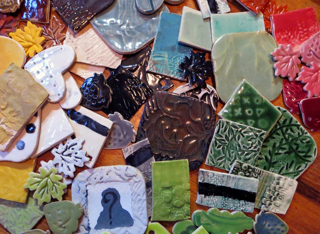
I have a passion for ceramic test tiles: looking at them, using them for reference and making them. It comes from being a lifelong collector of paint chips, a lover of color theory books and classes, and a plyer of other media before I came to ceramics. I’ve played with paints, watercolors, colored pencils, even with translucent or transparent papers. And while there are color interaction similarities among media, I’m here to testify that the understanding of ceramic surface decorating materials, especially glazes, is in another universe altogether. As usual, I have a few thoughts about that.
Glaze is not paint. Nope. Nope. Nope. A few of its qualities are paint-like: viscosity, surface shine variations, and sometimes, color. Many of its additional qualities – application responses, firing changes, clay body used, interactions with other surface qualities and finishes – are unique and variable and so un-paint-like they soon flummox. It doesn’t take long for a beginning ceramic student to despair of this. I don’t know anyone who got lucky with glazes real fast. Success with glazes comes from “the harder I work, the luckier I get” school. The complexity boggles and the creative heart still wants what it wants.
The Bisque Freeze. Unsuccessful glazing forays lead to a couple of places. One is what I’ve started to call The Bisque Freeze. It means one gets a hard case of the creative yips when deciding on the final surface decoration of one’s precious and still-perfect works, fresh out of their first firing. Who wants to muck them up with some contaminated bastard vat of turdiliciousness just like every damn time before? OK, maybe you’re not being graded on beauty, but YOU still want it. So much can go wrong in that glaze room and kiln and we are out of illusions. Sigh.
Another place glaze failures lead is to what I did: step away from glazing altogether into the land of more reliable color and surface results by using underglazes, stains, pencils, chalks and even a cold finish or two. I went in search of the matte and non-runny surface. You know, more like paint. I still used glazes, just more sparingly and in a sculptural manner and I did not care if they misbehaved a little. After all, I wasn’t making dinnerware.
And now my work is changing and I want to use glazes on whole bodies and runs of new stuff. And I still pretty much suck at reliable glazing, because I did not “work harder” beyond a certain point. Before I forsook glazing, though – over ten years now – I had the college glaze room to myself for a whole six week summer session and I taught myself how to mix and test over 100 glaze samples. I learned a bit of the rhyme and reason for their recipes and appearances and acquired enough understanding of chemicals and heatwork to serve me well. I can make informed choices to foster my new plans because I know more about what I’m looking at. Even so, I experiment.
Testing. Testing. Testing. While I’m developing my new works – their shapes, surfaces, colors, glazes and meanings – I have been running my test kiln nearly daily trying every combination I can think of using glazes I already own and eyeing plenty others as more possibilities arise. And even when something looks pretty wonderful, I try it again, maybe on a smaller form that came out of bisque as a second. It takes time to test like this, but it takes more time, energy and waste to NOT to. You see, fired ceramics last forever and it seems wrong to add any more to that global shard pile when I know how to avoid it.
A glaze test tile is not just a color chip. Oh, sure, it can be. And that’s probably its most common use, but there’s so much more to be learned by playing a tile to extremes. What happens when I underapply or overapply? When I dip, pour or brush? If it’s chunky, peeling or scratched? When it’s put over appliques, impressions, carving, sgraffito, hydroabrasion, stains and underglazes? Combinations of these? When the tile’s fired horizontally? Vertically? When glazes are combined or layered over each other? Manufacturer’s and glazemaking websites can give you many more ideas, but nothing compares to trying it with YOUR hands on YOUR work in YOUR kiln.
Finding what you’re looking for isn’t easy. So I have quit thinking it should be. Or that I even will. For me the benchmark has always been that my art looks inevitable. To that end I’m seeking an easy complementarity between my forms and surfaces. That’s the certain something that I know when I see it. A long time ago I sewed nearly all my clothes: dresses, coats, suits, prom gowns, shirts for the boyfriend. I made a lot of clunkers by ignoring how the pattern I fell in love with went with (or fought with) the fabric I fell in love with. I’m talking about using a flimsy handkerchief silk for an uber-tailored shirtwaist dress or making a softly gathered puff-sleeved empire maxi with a thick broadcloth. That clueless. That bad. It’s the same trap with the clay forms and the glaze choices, so fall in love with the ones that get along.
Liz Crain – who discovered during all the aforementioned testing a surprise bonus: she has a glaze color palette. It may look like a rainbow in that pile of tiles up top, but is it a carefully curated one. 😉
Great article, Liz! Thanks! Lisa Koester
Thank you Lisa and happy glazing!