Here’s to all those mandatory white booths at outdoor art exhibits. It coordinates the look of the festival, but it can un-orient a visitor. The artwork might be memorable, but, really, in an ocean of 10x10s arrayed in semi-meandering quasi-suburban tract rows, what sets one booth apart from another? Might as well be Cubicle Nation, Artisan Style.
As a visitor and at times the artist in one of those booths who wants to get found and remembered, I have taken a tiny step to address this sameness: descriptive signage on the outside valances of my EZ-Up.
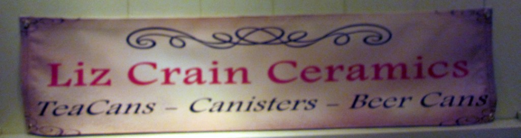
In this case these inexpensive vinyl banners (weather resisitant, hemmed and grommeted from Banners.com) not only feature my name and my medium, but also – and here’s the point – suggest what a ceramics aficionado might find within.
The Hard Parts?
1. Boldly naming and claiming my niche well enough to choose a phrase or intriguing tag words.
2. Deciding whether or not the banners should have my web address.
3. What “flavor” the banners should suggest. (I went with warm with a vintage feel.)
There you have it: I am a purveyor of TeaCans – Canisters – Beer Cans. And if you’re not quite certain what those are, you’re invited to come take a look see!
–Liz Crain, who has taken years to study the 10x10s of fellow ceramic artists in order to discover innovative, effective and secure ways to configure and present work in the weekend festival context. It is different for potters than it is for sculptors, and since she is a hybrid, has felt particularly challenged. But as of now, the signage bit she understands. It’s protecting against windy days, unattended children and ham-handed day-trippers that is confounding.